CLIENT: BONA LIFE INSURANCE
INSURANCE REBUILT FOR A NEW ERA IN BOTSWANA
Bona Life Insurance approached us at a critical moment in their journey. Following internal business challenges and reputational strain, the brand needed more than a surface refresh — it required a strategic reset that rebuilt trust, clarified purpose, and re-established confidence in the market.
Our objective was to reposition Bona Life as a credible, modern, and people-centred insurance provider in Botswana, while aligning its brand identity, communications, and digital presence with long-term business recovery and growth.
Our role extended across brand strategy, visual identity, digital experience, performance marketing, and campaign execution — supporting Bona Life’s relaunch from the inside out.
-
Before any creative execution, we conducted in-depth market and audience research that highlighted a strong need for clarity, transparency, and simplified messaging — particularly around products, claims, and customer support.
-
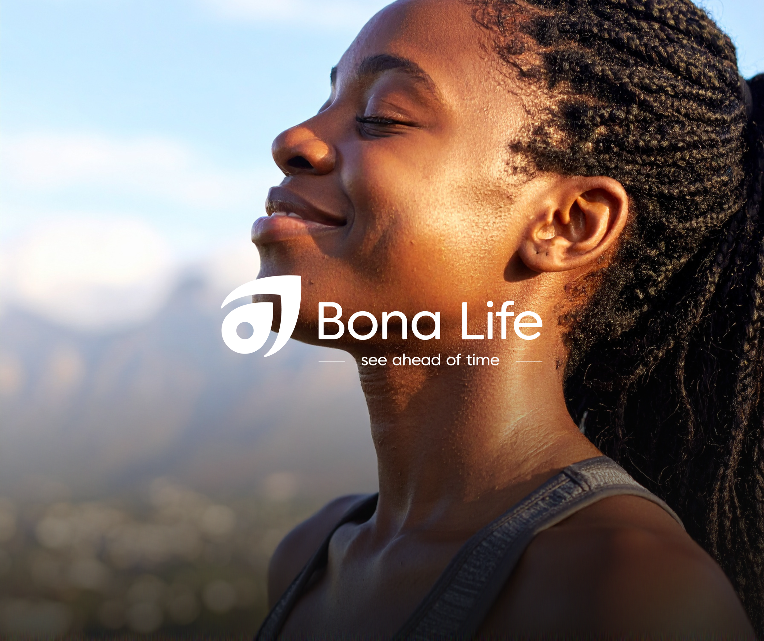
The core concept behind the Bona Life rebrand was reassurance through clarity.
We shifted the brand away from overly corporate or transactional communication toward a more human, supportive, and locally grounded identity. The refreshed concept positions Bona Life as a partner in life planning — not just a policy provider.
-
Our strategy centred on rebuilding trust at scale while supporting immediate business recovery.
This included:
Reintroducing the brand to the market through a structured relaunch
Aligning messaging across digital, print, radio, and in-person channels
Supporting lead generation through Google Ads and campaign-driven traffic
Ensuring consistency between brand promise, customer experience, and internal communications
We worked closely with Bona Life’s internal teams to ensure the strategy translated into real-world execution — from marketing campaigns to internal staff initiatives.
-
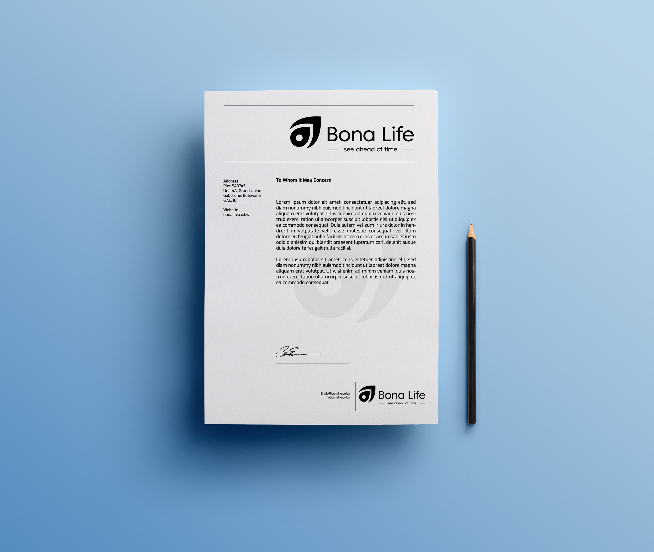
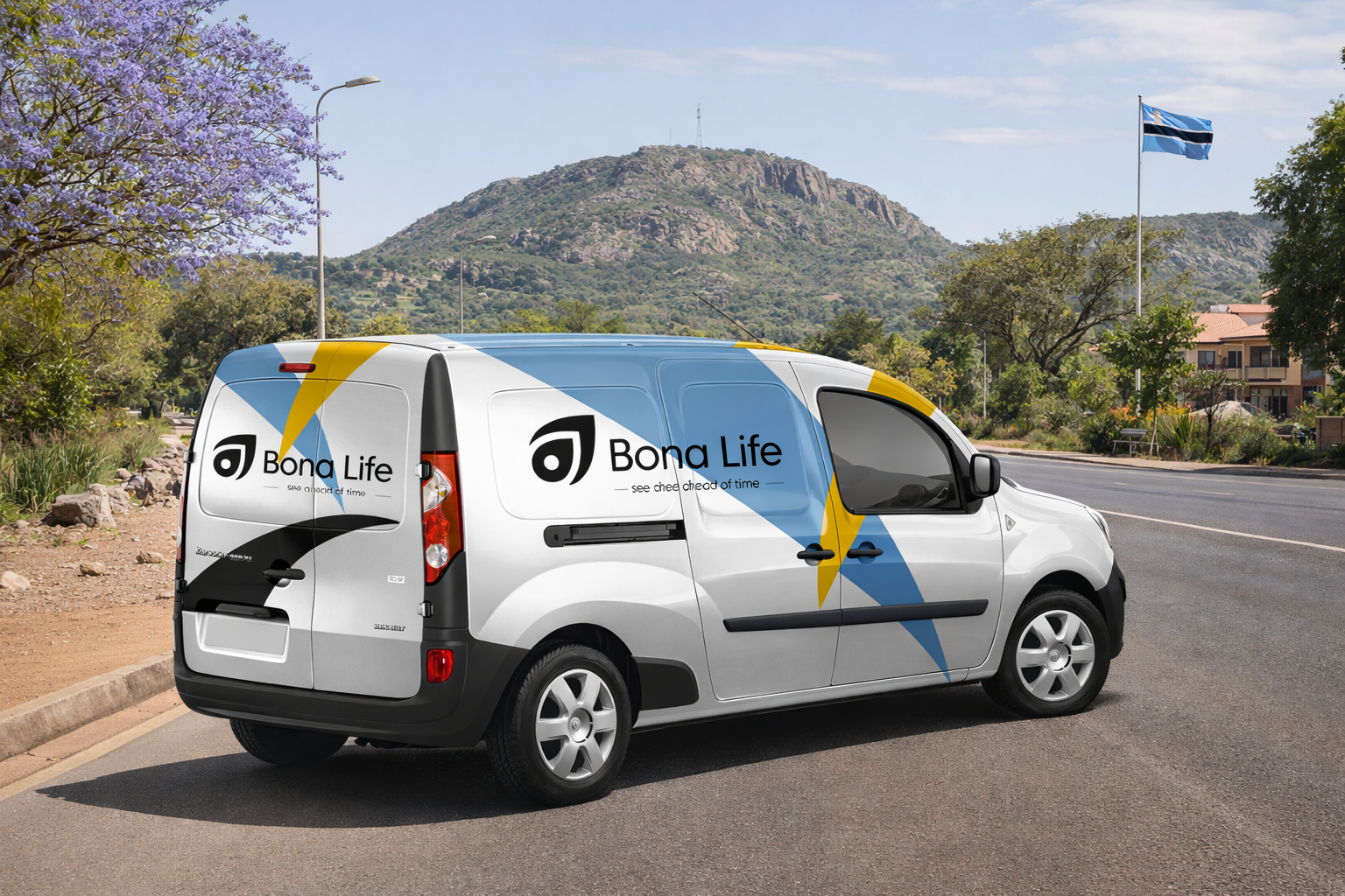
We led a full refresh of Bona Life’s brand CI, refining the visual language to feel modern, trustworthy, and relevant to the Botswana market.
-
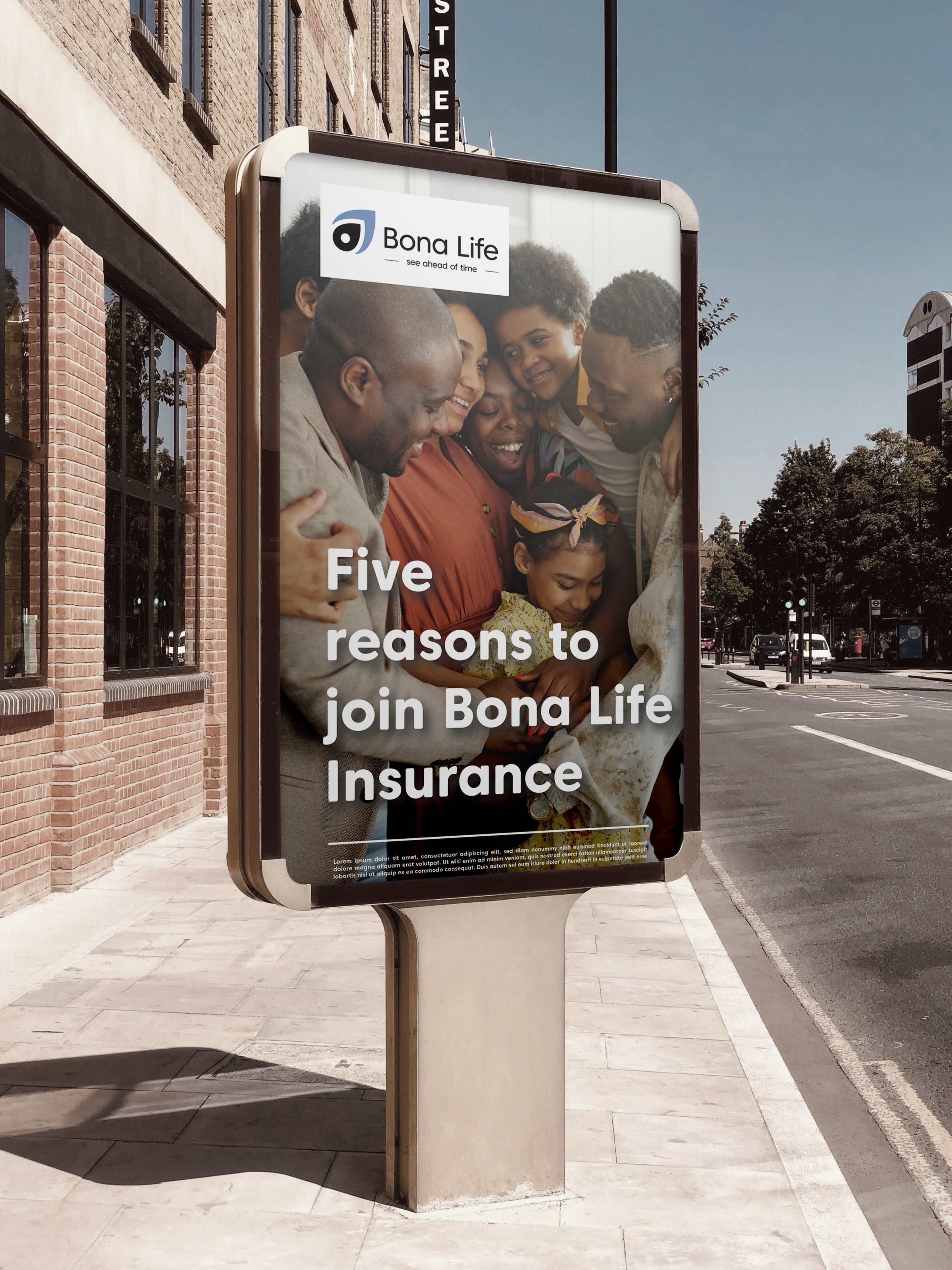
Our work extended across multiple media channels to ensure consistent brand presence:
Animated marketing videos
Magazine and newspaper advertising
Radio jingles and scripted audio campaigns
Promotional copywriting and campaign messaging
Event marketing visuals and printed collateral
Each asset was developed to reinforce trust, clarity, and professionalism — ensuring the brand communicated with one clear voice, regardless of channel.
-
We supported Bona Life’s market re-entry through targeted Google Ads campaigns designed to rebuild visibility and drive qualified enquiries.
Alongside performance marketing, we executed multiple event-led campaigns — assisting with event strategy, marketing collateral, on-site branding, and promotional roll-out. These campaigns played a key role in reintroducing the brand to stakeholders, partners, and the wider public.
-
Our focus was on strategic optimisation — refining the existing site’s structure, messaging, and performance to better reflect the refreshed brand and support both users and search engines.
Our work included:
SEO optimisation
Website copywriting refresh
Clarifying product messaging
The result was a more confident, consistent, and search-friendly digital presence.
-
Alongside digital and media activity, we delivered a comprehensive suite of brand collateral to support Bona Life’s relaunch across every physical and customer-facing touchpoint.
Our work extended far beyond individual assets, focusing instead on building a cohesive, professional brand presence that could scale across offices, events, vehicles, print media, and internal communications.
OVERVIEW: Corporate Identity Rebrand
STRATEGY & APPROACH
Bona Life was entering a critical phase where public perception mattered just as much as product offering.
The relaunch needed to:
Repair brand confidence in a competitive market
Strengthen their corporate identity and communications
Create a website experience that felt modern, trustworthy, and easy to navigate
Support campaigns across digital, print, radio, and events — without inconsistency or “patchwork” branding
In short: Bona Life needed a cohesive brand system that could perform everywhere.
WORKSHOPS & RESEARCH
-
We facilitated a series of structured workshops with key stakeholders to reassess Bona Life’s corporate identity and brand perception — both internally and in the public eye.
These sessions focused on:
Understanding internal challenges and reputational pain points
Clarifying Bona Life’s role, responsibility, and value within the insurance market
Identifying gaps between perception and intention
Establishing a shared vision for the future of the brand
The insights gathered informed the rebranding of Bona Life’s Corporate Identity, ensuring the refreshed visual language, tone, and messaging were grounded in real organisational context — not surface-level aesthetics.
This process created alignment across teams and laid the strategic foundation for a confident market re-entry.

NAMING, STRATEGY & POSITIONING
-
With the new corporate identity in place, we refined Bona Life’s positioning to clearly articulate what the brand stands for and how it serves its customers.
Central to this work was the development of a new brand line:
“See Ahead of Time.”This positioning reflects Bona Life’s role in helping individuals and families plan, protect, and prepare for the future — reinforcing foresight, reassurance, and long-term security as core brand values.
The naming and positioning strategy informed:
Brand messaging across all channels
Marketing campaigns and event communications
Print, radio, and digital advertising
Website copy and UX direction
By anchoring the brand around a clear, forward-looking promise, Bona Life was able to re-enter the market with renewed confidence, clarity, and relevance.
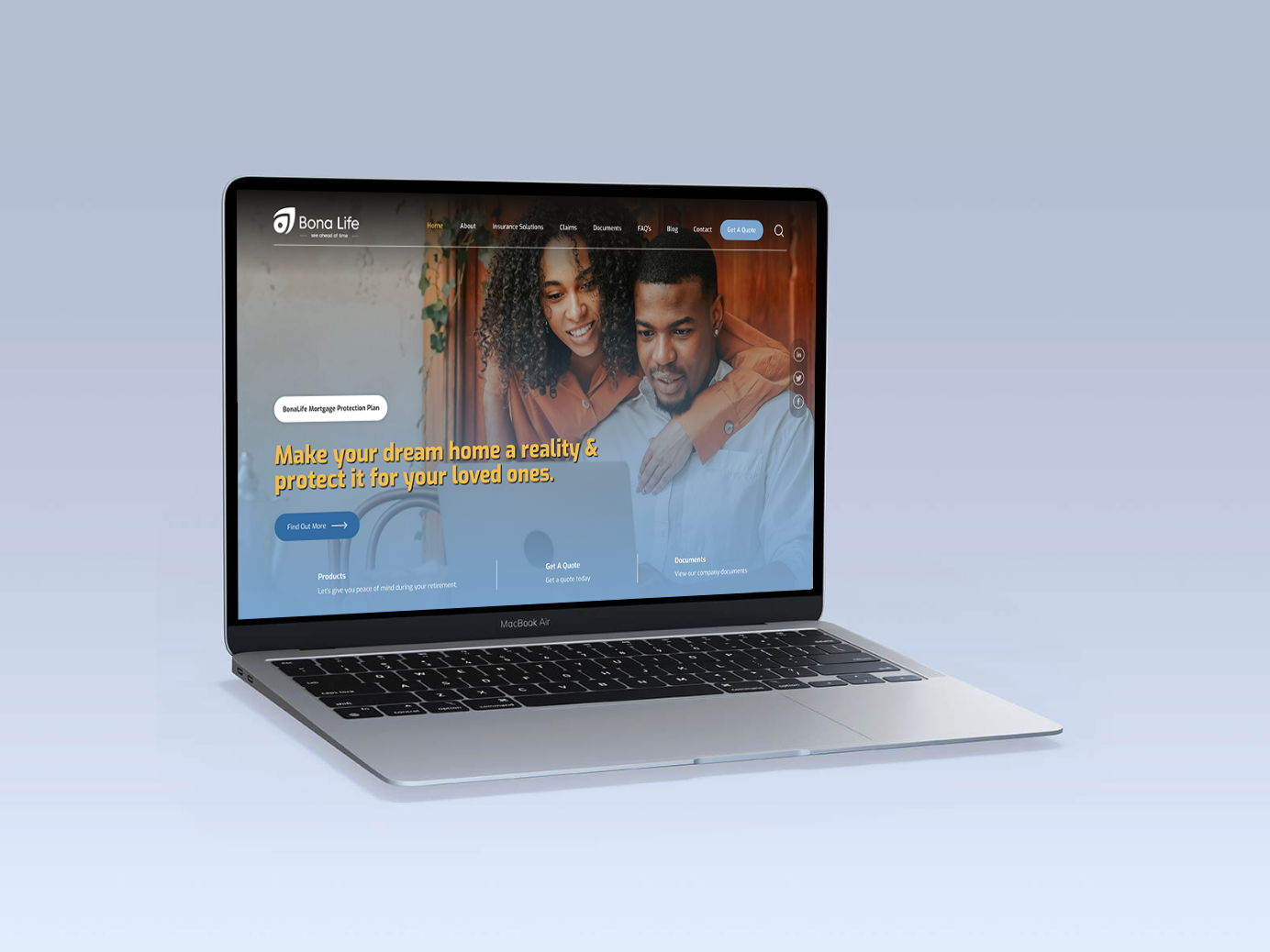
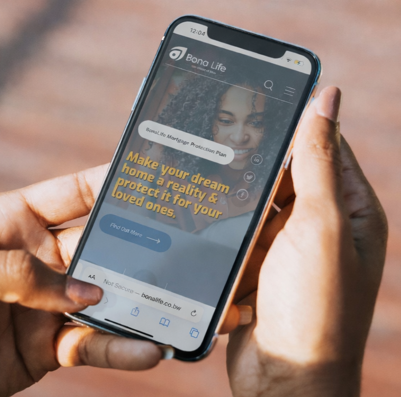
Website Design (UI, UX & Copy Support)
A TRUSTED DIGITAL PRESENCE
We redesigned the Bona Life website with a focus on clarity, usability, and trust.
Our work included:
UI and UX design improvements
A clearer site structure and navigation
Website copy support (simplifying insurance language and making it more digestible)
A more modern and consistent visual experience aligned to the refreshed CI
Result: a website that feels less like a brochure and more like a confident digital platform built for conversion and education.
DIGITAL MARKETING
GOOGLE-ADS & CAMPAIGN SUPPORT
To support the relaunch and ongoing marketing needs, we assisted with Google Ads initiatives, ensuring campaign assets and messaging stayed aligned with the refreshed brand direction.
This included:
Supporting digital rollouts for marketing campaigns
Ensuring brand consistency across ads and campaign collateral
Helping position Bona Life clearly in a competitive space
-
Dose Coach’s identity was built around calm authority and human connection.
The brand balances intelligence and warmth, positioning coaching as a grounded, purpose-led experience rather than a high-pressure performance product. -
The styling is slightly psychedelic and intentional, using reverb, space, and motion to reflect the coaching experience itself.
Every visual decision supports focus, flow, and a sense of considered leadership.
PERFORMANCE MARKETING
THROUGH-THE-LINE PRINT ADVERTISING CAMPAIGN
We led a full refresh of Bona Life’s brand CI, refining the visual language to feel modern, trustworthy, and relevant to the Botswana market.
This included updates to colour usage, typography, layout systems, and visual hierarchy — ensuring the brand felt cohesive across digital platforms, printed material, and event environments.
The new visual system was designed to scale across multiple products and campaigns while remaining recognisable, approachable, and professional.
-
Dose Coach’s identity was built around calm authority and human connection.
The brand balances intelligence and warmth, positioning coaching as a grounded, purpose-led experience rather than a high-pressure performance product. -
The styling is slightly psychedelic and intentional, using reverb, space, and motion to reflect the coaching experience itself.
Every visual decision supports focus, flow, and a sense of considered leadership.
BRAND COLLATERAL
Brand collateral for Dose Coach was designed to extend the brand beyond digital touchpoints.
Each element — from printed materials to digital assets — follows the same principles, ensuring a consistent and considered presence across every interaction.