

Graphic Design for Digital Marketing: How to Make Visuals That Convert
Why Design Is the Unsung Hero of Digital Performance
When we talk about graphic design in the context of digital marketing, it’s easy to reduce it to “making things look good.” But performance-driven design is about more than aesthetics. It’s about stopping the scroll, telling a story, and driving action—whether that’s a click, a sign-up, or a purchase.
Great design can directly impact metrics like click-through rates (CTR), ad costs, and conversion rates. In short: good visuals don’t just look professional; they work hard behind the scenes to fuel your marketing performance.
Good Design vs. High-Converting Design
Not all design is created equal. A beautiful post may get likes, but does it push people to act? That’s the difference between “good” design and “high-converting” design.
Aesthetics vs. Functionality – Pretty layouts mean little without a clear path to action.
Emotion vs. Clarity vs. Action – Effective visuals balance intrigue with crystal-clear messaging.
Brand-Aligned vs. Trend-Chasing – Performance ads should reflect your brand identity, not just the latest fad.
Hierarchy Matters – Strong marketing design tips include structuring visuals so the eye naturally flows from hook → value → CTA.
👉 Example: Compare a cluttered ad where the CTA blends in, versus a clean ad with bold contrast and one button. The second will almost always outperform the first.

A weak CTA example: Archer & Olive’s ‘Shop Now’ button blends into the background. The soft pink on pale blue lacks contrast, making the action hard to spot at a glance. Without strong visibility and hierarchy, even great offers risk being ignored.
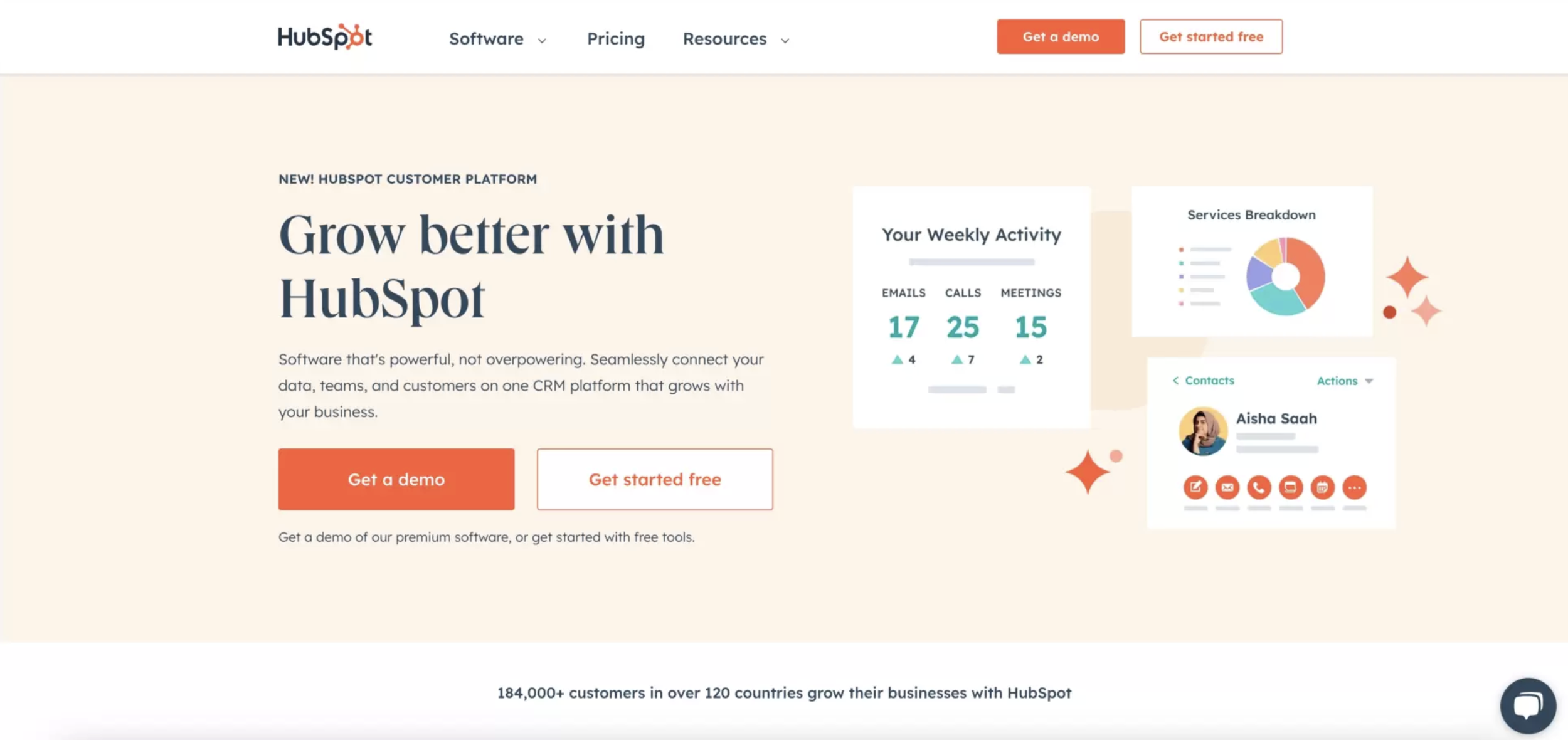
A strong CTA example: HubSpot’s homepage uses bold orange buttons with clear copy like ‘Get a demo.’ High contrast, whitespace, and prime placement make the action unmistakable—drawing the eye instantly and driving clicks.
5 Principles of Performance-Driven Graphic Design
1.Visual Hierarchy
Guide the viewer’s eye from the most important element (the hook) through the supporting message, and finally, the CTA.

Apple nails hierarchy: headline first, product second, CTA last—guiding the eye in perfect order.
2. Bold Simplicity
Whitespace and contrast are underrated. The less clutter, the faster your message lands.

Nike uses whitespace to perfection: the empty sky frames the bold message, letting ‘Find Your Greatness’ land with full impact.
3. Message-First Thinking
The design should support and amplify the copy—not distract from it.

Spotify puts the message first: bold, witty headlines take center stage, with design elements kept minimal to let the words do the work.
4. Format-Specific Design
What works on Instagram Stories may flop in an email header. Always design with the platform in mind. A strong brand example is Starbucks.

On Instagram Stories, Starbucks uses vertical, full-screen visuals with bold overlay text like “Sip into Summer”, designed to be read in under 3 seconds.
5. Brand Consistency
Fonts, colors, and tone should align with your brand guidelines, even in ads. Consistency builds trust.

Coca-Cola shows brand consistency: the same red, typography, and voice across bottles, billboards, and digital ads.
Applying These Principles in Real Life
Organic Social Posts – Infographics, Reels covers, and carousel posts with narrative flow drive higher engagement.
Paid Ads – Think bold thumbnails, eye-catching 3-second hooks, and strong CTA buttons.
Email Design – Header graphics should seamlessly guide readers toward the next action.
Landing Pages – Use trust-building layouts, iconography, and minimal but sharp visuals that keep the CTA visible.
At Legs Brands®, we often remind clients that designing visual content that converts isn’t about adding more; it’s about making every pixel count.
Tools That Make It Easier
Not every team has a full-time designer. Luckily, tools like Canva, Figma, and Adobe XD make it easier to DIY.
Use templates, brand kits, and swipe files to keep your content consistent and on-brand. This helps startups and small businesses execute faster without sacrificing design quality.
Legs Brands in Action
At Legs Brands®, design and performance aren’t siloed. We combine creative strategy with execution so every visual has a measurable purpose.
For example:
A carousel post we designed for Driftwood Mentawai showcased the essence of surf camp life in a clear, story-driven flow—and generated a surge of engagement and inquiries.
Paid ad creatives for Bona Life used high-contrast design and strong CTAs, reducing cost-per-click while increasing engagement.
These wins come from applying the same design for social media ads principles we’ve outlined above.
Quick Creative Testing Tips
When reviewing your own visuals, ask:
Can someone understand the message in 3 seconds?
Is the CTA clear and easy to click?
Does the design feel consistent with the brand?
If you answered “no” to any of these, you’ve found an easy place to improve.
Final Takeaway
Performance-driven design is where creativity meets strategy. By applying clear principles and using the right tools, you can make your digital marketing visuals do more than decorate—they can convert.
Whether you’re a startup DIYing your content or a brand manager ready to scale, strong design is the bridge between message and action.
Want visuals that don’t just look good—but convert? Let Legs Brands® design high-performance creative for your next campaign.