Client: Dose Coach (Now FloLab)
PURPOSE-LED LEADERSHIP & PERFORMANCE COACHING
Dose Coach (now Flolab) partnered with us to evolve their brand into a refined identity that communicates clarity, performance, and adaptive leadership in a complex world.
The outcome was a complete system — from brand identity and logo design to experience collateral and a distinctive digital presence — that reflects Flolab’s mission to help executives, founders, and high-performers operate with purpose, flow, and sustainable impact.
-
We began with purpose discovery workshops and persona mapping to understand Dose Coach’s audience, values, and long-term vision.
This research informed a clear positioning strategy focused on leadership clarity, performance, and flow.
-
The concept centred on leadership as a state of flow — combining purpose, presence, and performance.
Dose Coach needed a brand that felt intelligent, calm, and human, avoiding corporate coaching clichés.
-
Our strategy focused on defining a clear brand architecture and communication framework.
This ensured Dose Coach could consistently articulate their offering across digital platforms, client engagement, and long-term brand growth.
-
We created a full brand identity and CI system, including logo design, typography, colour palette, and visual guidelines.
The identity balances clarity and warmth — reflecting both the professionalism and human depth of the coaching experience.
-
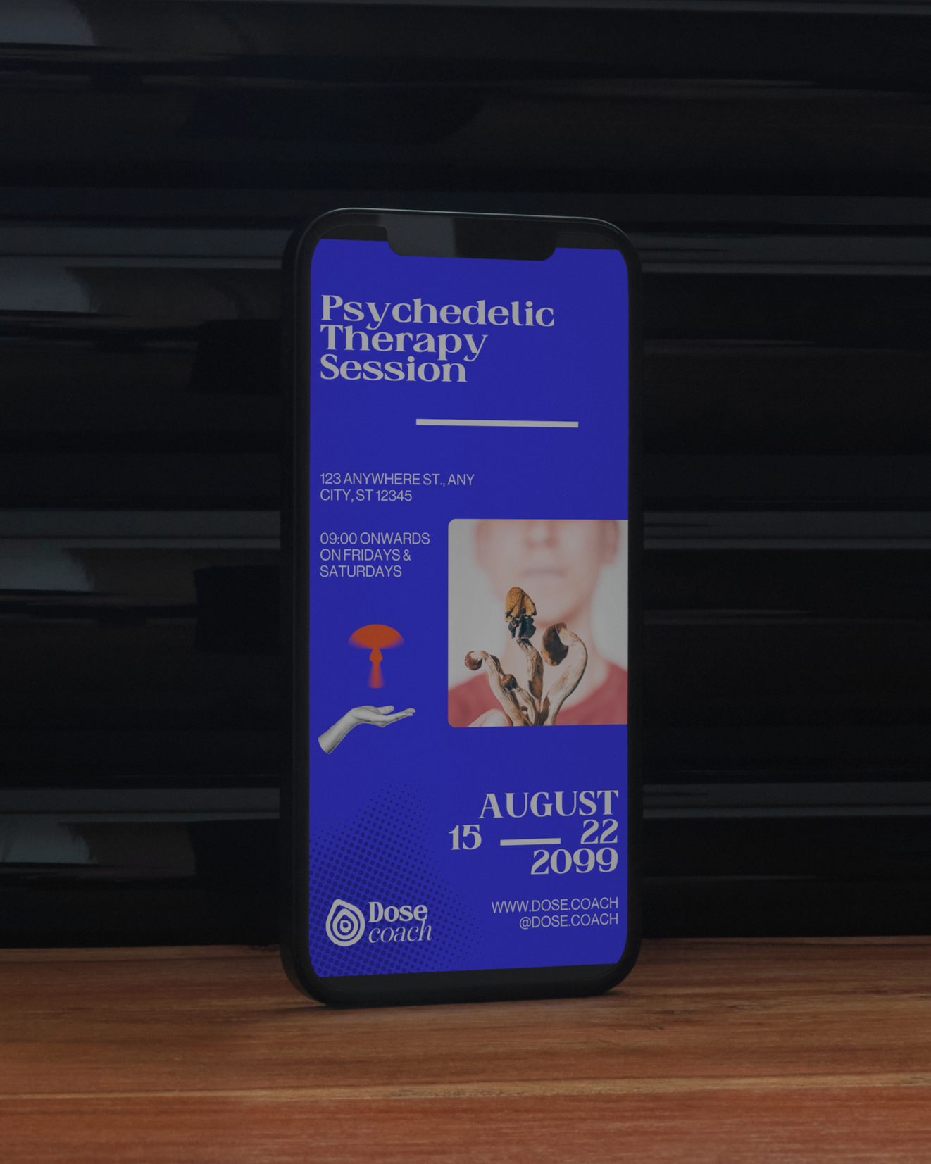
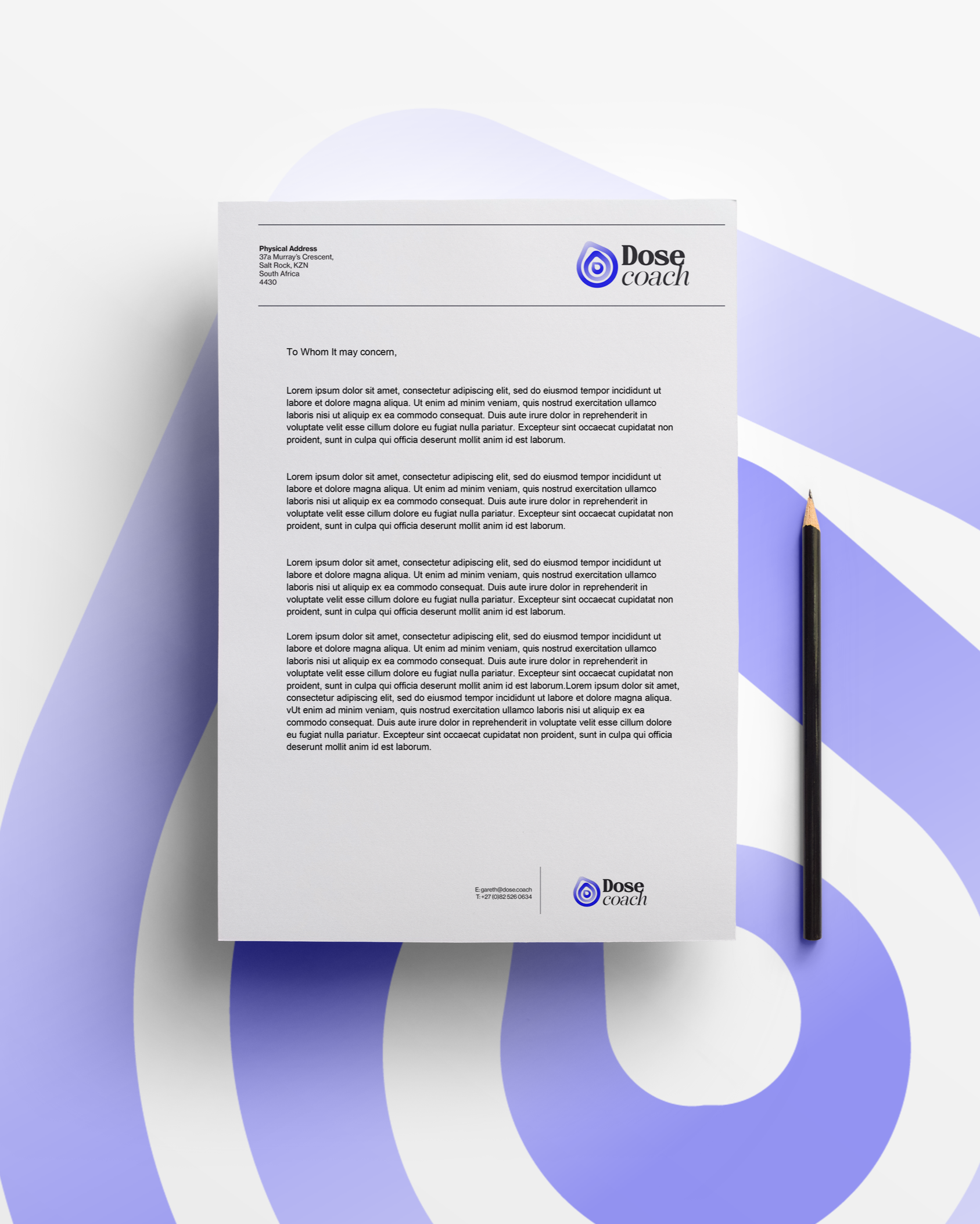
To support brand rollout, we designed a suite of core collateral including letterheads, business cards, and email signatures.
Each piece reinforces consistency and professionalism across every client interaction.
-
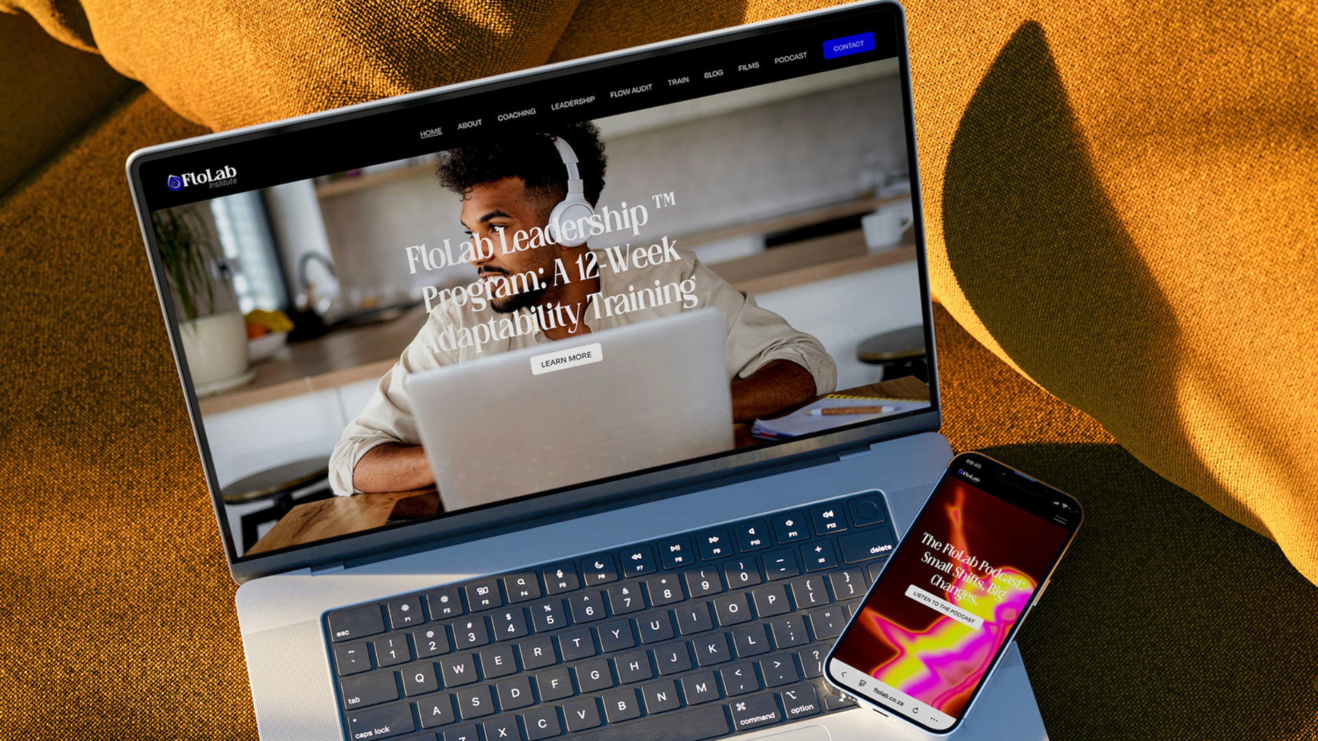
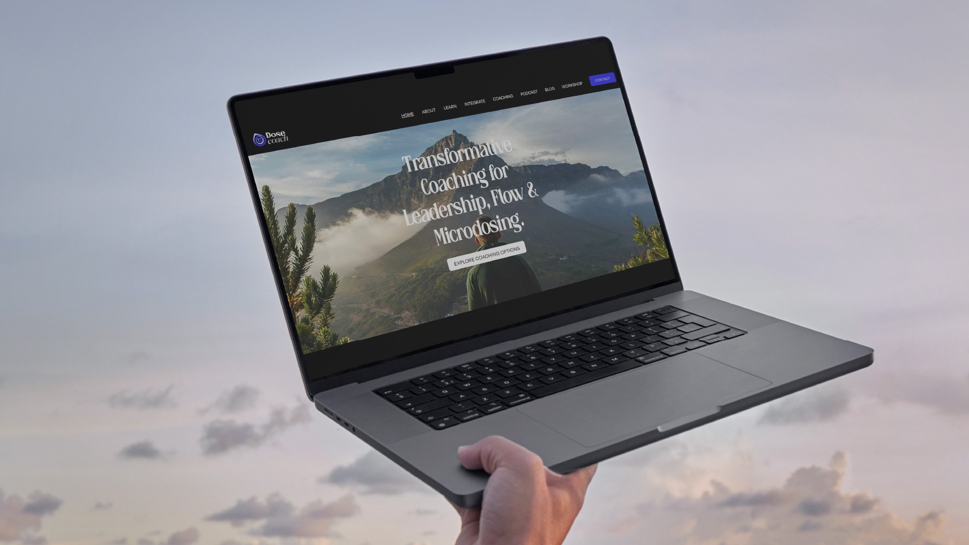
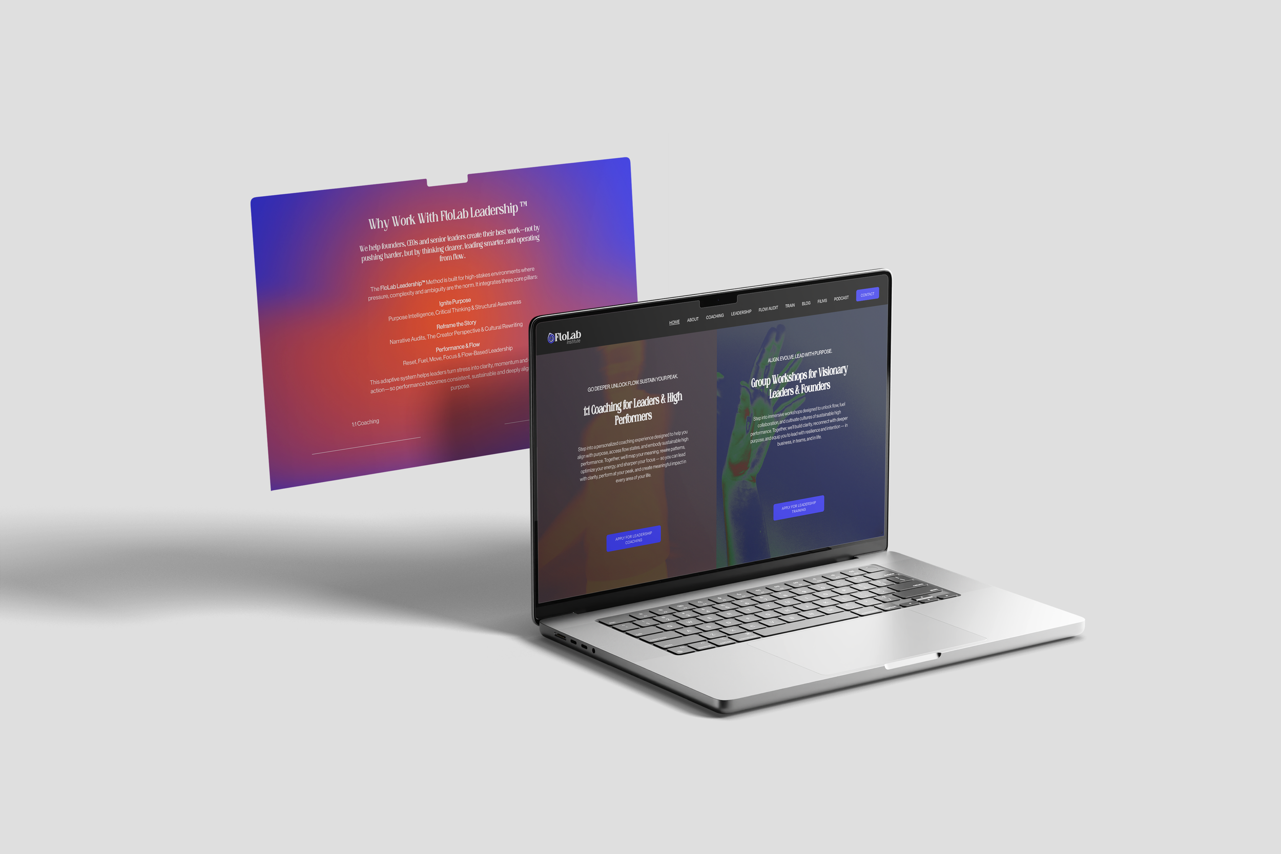
The Dose Coach website was designed to reflect the clarity and intent of the brand.
Built as a clean, elegant digital presence, it clearly communicates the coaching philosophy and offering while supporting trust and engagement.
Overview
LEAD WITH PURPOSE. PERFORM AT YOUR PEAK
Dose Coach partnered with Legs Brands to clarify their purpose and translate it into a cohesive brand and digital presence.
Through deep research and collaborative workshops, we helped shape a leadership and performance coaching brand rooted in clarity, flow, and sustainable impact.
Supported by a refined identity system and a considered website experience.

PERSONA MAPPING
-
We mapped Dose Coach’s core audience — purpose-driven leaders, founders, and high-performing professionals navigating complexity and change.
This helped define clear demographic markers alongside deeper psychographic drivers such as motivation, pressure points, decision-making styles, and leadership challenges.
-
Beyond surface data, we explored emotional and behavioural insights — clarity vs overwhelm, performance vs burnout, ambition vs sustainability.
These insights shaped a brand that speaks to leaders seeking flow, presence, and long-term impact rather than short-term optimisation.

WORKSHOPS & RESEARCH
-
Purpose discovery workshops formed the foundation of the brand, clarifying Dose Coach’s mission, values, and long-term vision.
These sessions aligned the coaching philosophy with how the brand communicates, looks, and behaves across every touchpoint.
-
We supported the workshop insights with broader research into leadership, performance coaching, and behavioural science.
This ensured the brand positioning felt credible, grounded, and relevant within the wider coaching and personal development landscape.

NAMING, STRATEGY & POSITIONING
-
We worked through naming and narrative direction to ensure the brand name reflected clarity, purpose, and forward movement — setting the foundation for its evolution into Flolab.
-
The brand strategy positions Dose Coach as a calm, intelligent alternative to traditional performance coaching.
Focused on flow, purpose, and sustainable leadership, the positioning differentiates the brand through depth rather than intensity.
Execution
DESIGNED TO CREATE CLARITY, FLOW, AND PURPOSEFUL PERFORMANCE
In executing Dose Coach’s brand, our focus was on distilling complexity into clarity.
We developed a complete brand identity and communication system — from strategy and visual direction to collateral and web — ensuring consistency, credibility, and purpose across every touchpoint.
-
Dose Coach’s identity was built around calm authority and human connection.
The brand balances intelligence and warmth, positioning coaching as a grounded, purpose-led experience rather than a high-pressure performance product. -
The styling is slightly psychedelic and intentional, using reverb, space, and motion to reflect the coaching experience itself.
Every visual decision supports focus, flow, and a sense of considered leadership.
LOGO TYPE
The Dose Coach logo is a visual representation of transformation through small, intentional change. The concentric forms within the icon symbolize the ripple effect created when a single habit shifts, gradually influencing every layer of life around it.
At the center sits the “D”, representing the individual beginning their journey. As the rings expand outward, they reflect the process of growth, momentum, and long-term change that emerges from consistent daily actions. Much like a small dose that compounds over time, the icon captures the philosophy of Dose Coach: meaningful transformation does not happen overnight, but through steady, deliberate habits that reshape life in powerful and lasting ways.
Offering
A PURPOSE-LED LEADERSHIP AND PERFORMANCE COACHING EXPERIENCE BUILT FOR MODERN, HIGH-IMPACT LEADERS.
Dose Coach supports individuals and teams through leadership coaching rooted in purpose discovery, behavioural insight, and long-term performance — helping clients navigate complexity with confidence and intention.
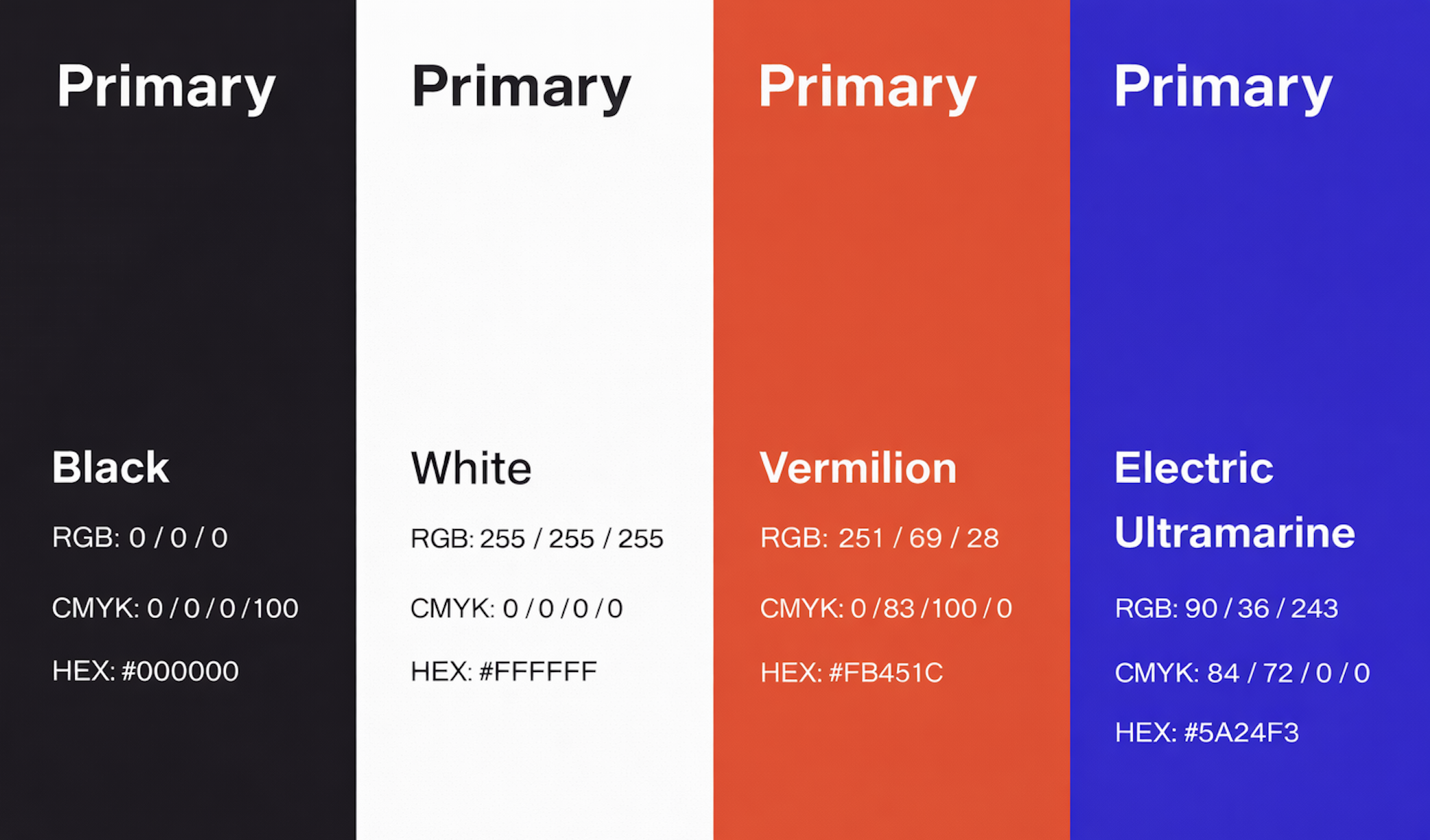
COLOUR USAGE
-
The primary colour palette for Dose Coach is bold, confident, and modern. It reflects clarity, precision, and authority, while remaining clean and highly functional across digital and print applications.
Vermilion
Electric Blue
Black
White
-
Charcoal Gray
Warm Beige
Soft White
Digital: Website Development & Social Media
A BOLD DIGITAL PRESENCE
The Dose Coach website was designed to reflect the flow and growth of the individual through movement of objects and creative assets. Built as an energetic digital presence, it clearly communicates the coaching philosophy and offering while supporting trust and engagement.
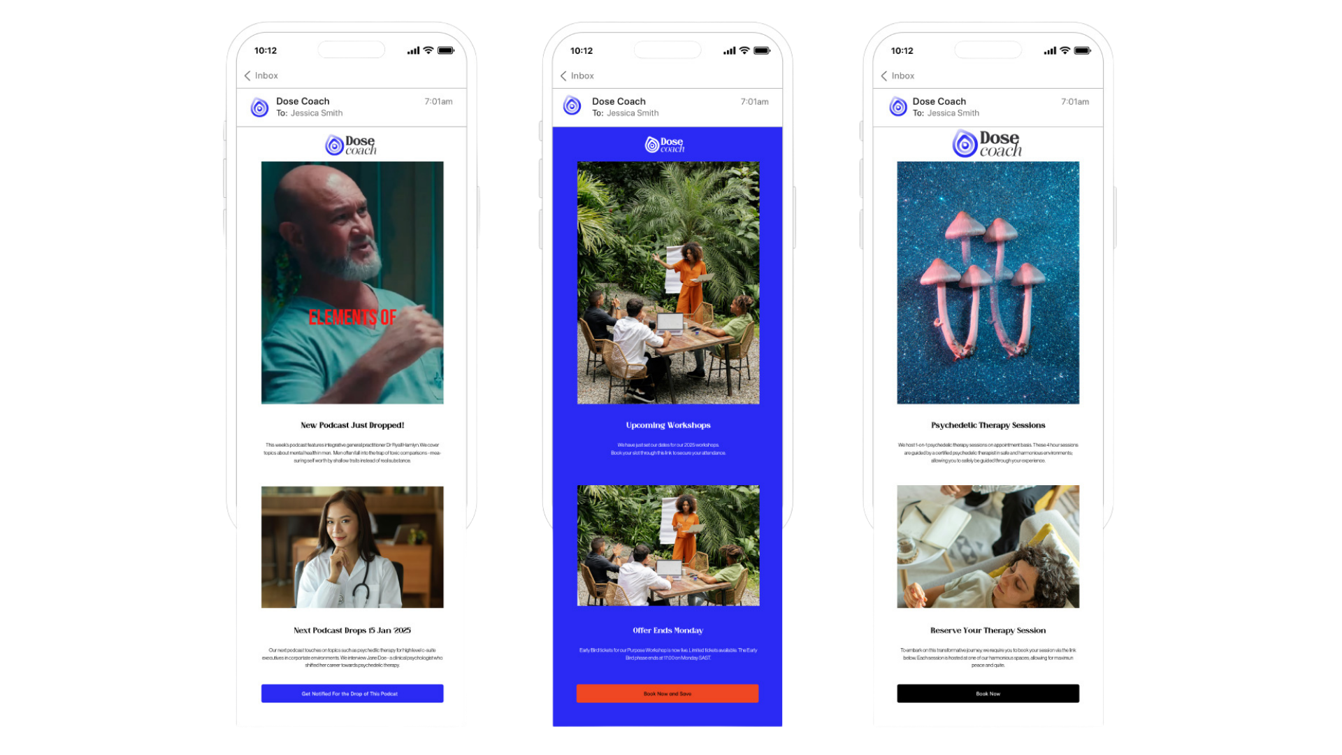
IMAGERY
HUMAN-CENTRED WITH NATURAL LIGHT
Imagery focuses on people, presence, and environment rather than performance theatrics.


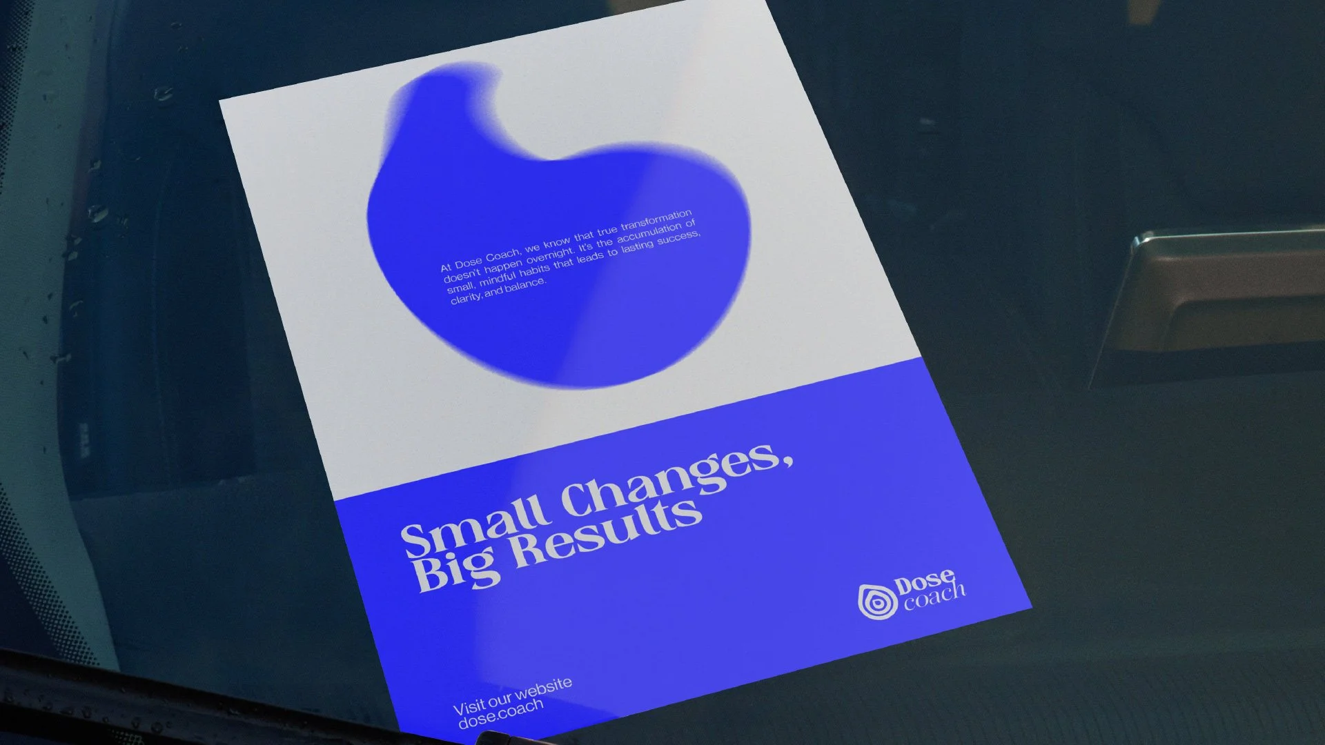
BRAND COLLATERAL
Brand collateral for Dose Coach was designed to extend the brand beyond digital touchpoints.
Each element — from printed materials to digital assets — follows the same principles, ensuring a consistent and considered presence across every interaction.