SKYTRADR
FUTURE AVIATION, NOW
CHALLENGE
Skytradr set out to reimagine how advanced air mobility brands present themselves to a global, high-net-worth and enterprise audience.
The challenge was to create a brand system that could balance cutting-edge technology with trust, clarity, and desirability — positioning Skytradr as both an innovator and a credible industry leader.
Within a traditionally conservative and fragmented aviation landscape, there was also a clear gap for a platform that could communicate discretion, transparency, and ease of use, while still meeting the expectations of a highly specialised audience.
The brand needed to feel modern and digital-first, without alienating an industry built on legacy, precision, and trust.
STRATEGY
We approached the project by building a future-focused brand system designed to translate seamlessly across identity, platform, and user experience.
Research into aviation marketplaces, user expectations, and visual standards informed a direction that balances technical precision with clarity and accessibility.
The strategy focused on creating a brand that signals trust and professionalism instantly, while maintaining a modern, digital-first presence that can scale across platform UI, marketing, and future offerings.
Every decision was guided by longevity, adaptability, and clarity — ensuring the system remains flexible enough to evolve with the platform, while maintaining a strong and consistent identity.
NEXT-GEN AVIATION, REDEFINING PRIVATE AIR MOBILITY
Skytradr is a next-generation aviation platform focused on redefining how private aircraft are bought, sold, and positioned within a modern digital environment. The project required a brand and system capable of bridging two worlds — advanced air mobility and high-value enterprise audiences — while introducing a more structured, transparent, and accessible approach to aircraft trading.
Legs Brands was brought in to develop the brand, positioning, and digital foundation — ensuring the platform could communicate with both clarity and credibility from launch.
-
We began by analysing the aviation and private aircraft trading landscape, identifying a clear gap for a platform that balanced trust, discretion, and modern usability.
Research focused on:
Existing aviation marketplaces and their limitations
User expectations around credibility, transparency, and ease of use
The visual and functional standards required to appeal to high-value, specialist audiences
These insights informed a brand that feels technical yet human — credible without being corporat
-
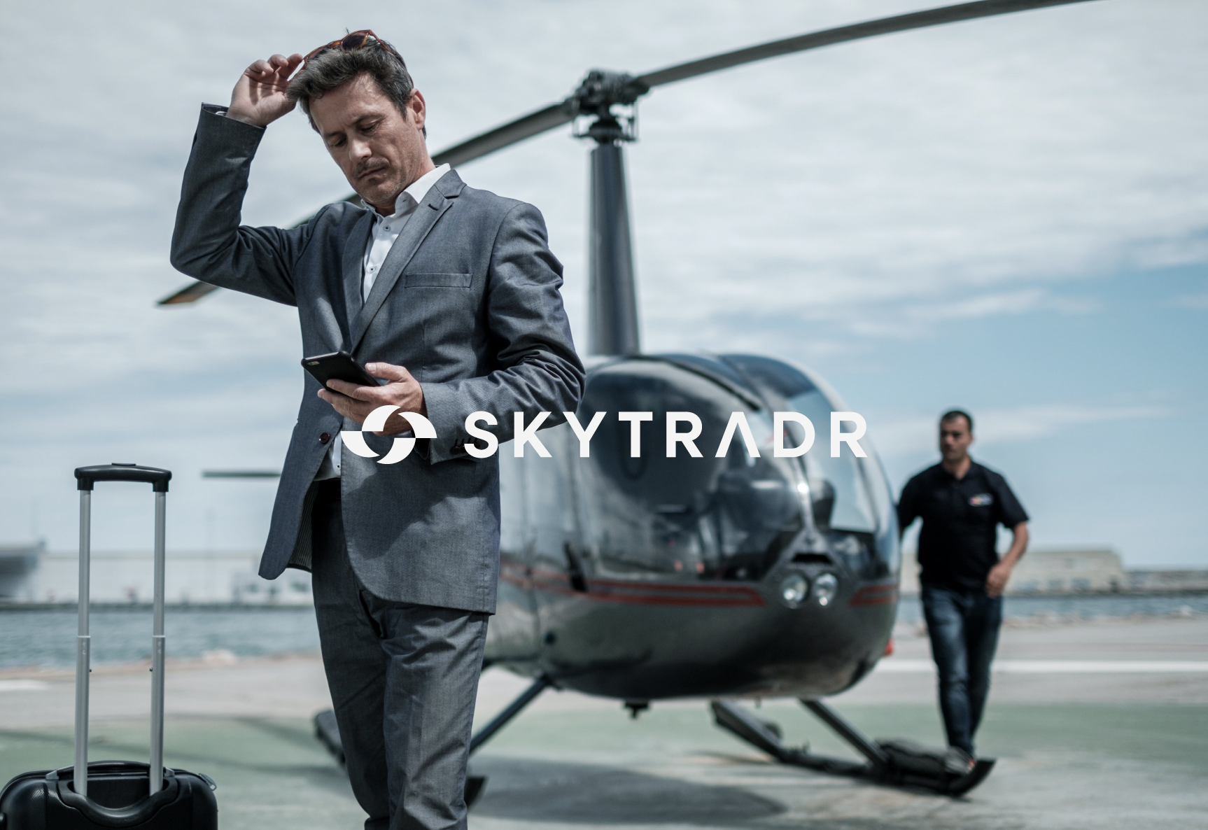
The Skytradr concept centres on connection, movement, and flow — reflecting both the physical nature of aviation and the digital environment the platform operates within.
This idea translated into a modular visual system built around circular forms, gradients, and negative space, symbolising exchange, continuity, and seamless transactions between trusted parties.
Branding & Identity
ENGINEERING THE BRAND
Rather than creating a decorative or trend-driven identity, the focus was on precision, clarity, and control.
The logo and typography were developed to feel technical and refined — drawing from the principles of aerospace engineering and digital systems.
A minimal, high-contrast palette ensures the brand communicates authority and focus, while allowing the platform and its content to remain the primary point of engagement.
Every element was designed to balance innovation with trust — creating an identity that feels both forward-thinking and grounded within a traditionally conservative industry.
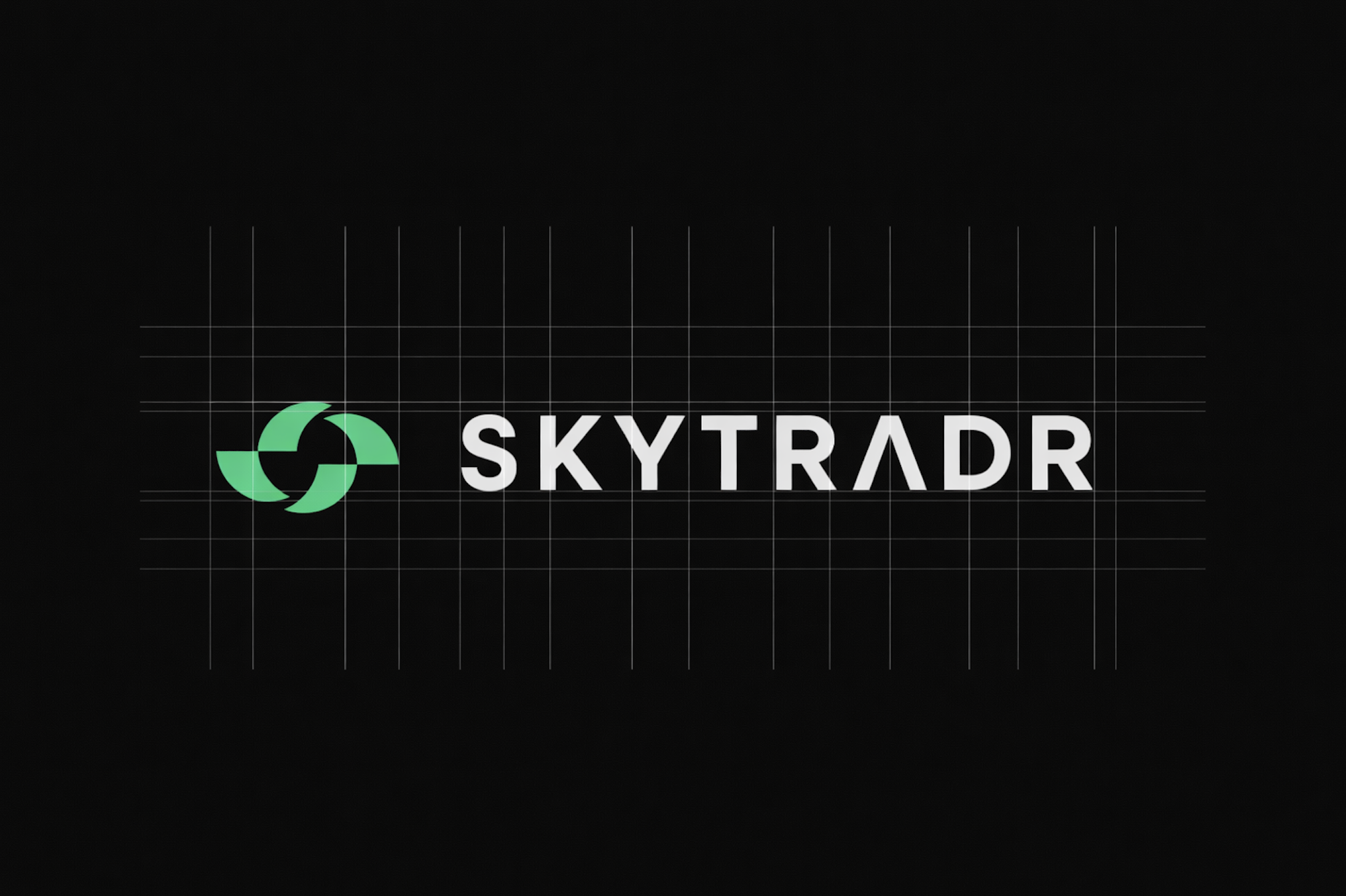
WORDMARK
-
The Skytradr wordmark was designed for clarity and confidence, prioritising legibility across large-scale digital environments and technical documentation.
-
The primary typeface, Neue Montreal, was selected for its balance between technical precision and contemporary character.
Typography choices support a modern, engineered aesthetic — clean, technical, and highly readable, reinforcing trust and professionalism.
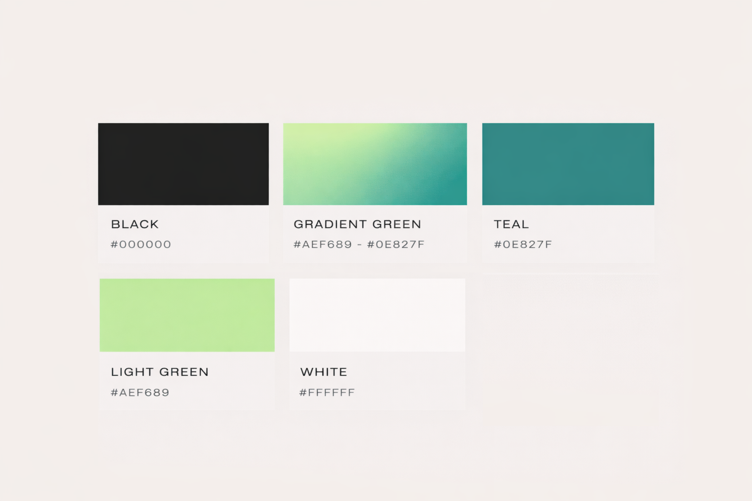
COLOUR PALETTE
-
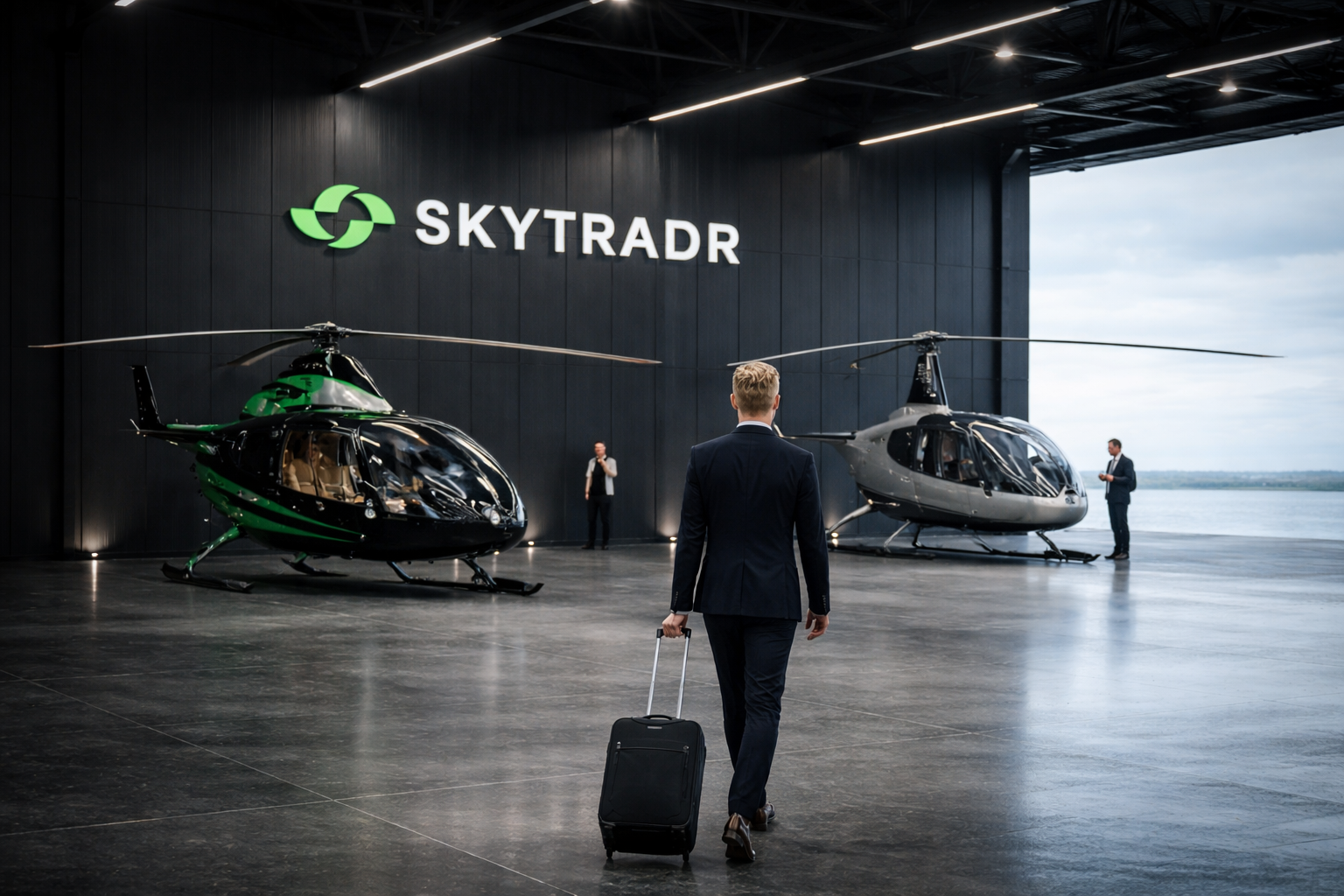
Black is the primary background colour, used to convey luxury, focus, and technical sophistication
White is reserved for typography and key interface elements to ensure high contrast and clarity
Green accents are used sparingly to highlight interaction points, product identifiers, and brand moments
Gradients are applied selectively to add dimensionality without overpowering the experience
-
The palette is intentionally minimal, ensuring the brand remains timeless, premium, and adaptable across digital and physical environments.
Strategy
BUILDING A BRAND SYSTEM
From a strategic standpoint, the brand needed to signal trust and professionalism instantly, while presenting a modern, digital-first identity within a traditionally conservative industry.
The approach focused on creating a system that balances innovation with familiarity — ensuring the platform feels advanced and forward-looking without alienating established market expectations.
Scalability was central to the strategy. The brand needed to extend seamlessly across platform UI, marketing, and future sub-brands, while maintaining clarity and consistency across all touchpoints.
Every decision was guided by longevity, adaptability, and precision — building a foundation that supports both immediate launch and long-term growth.
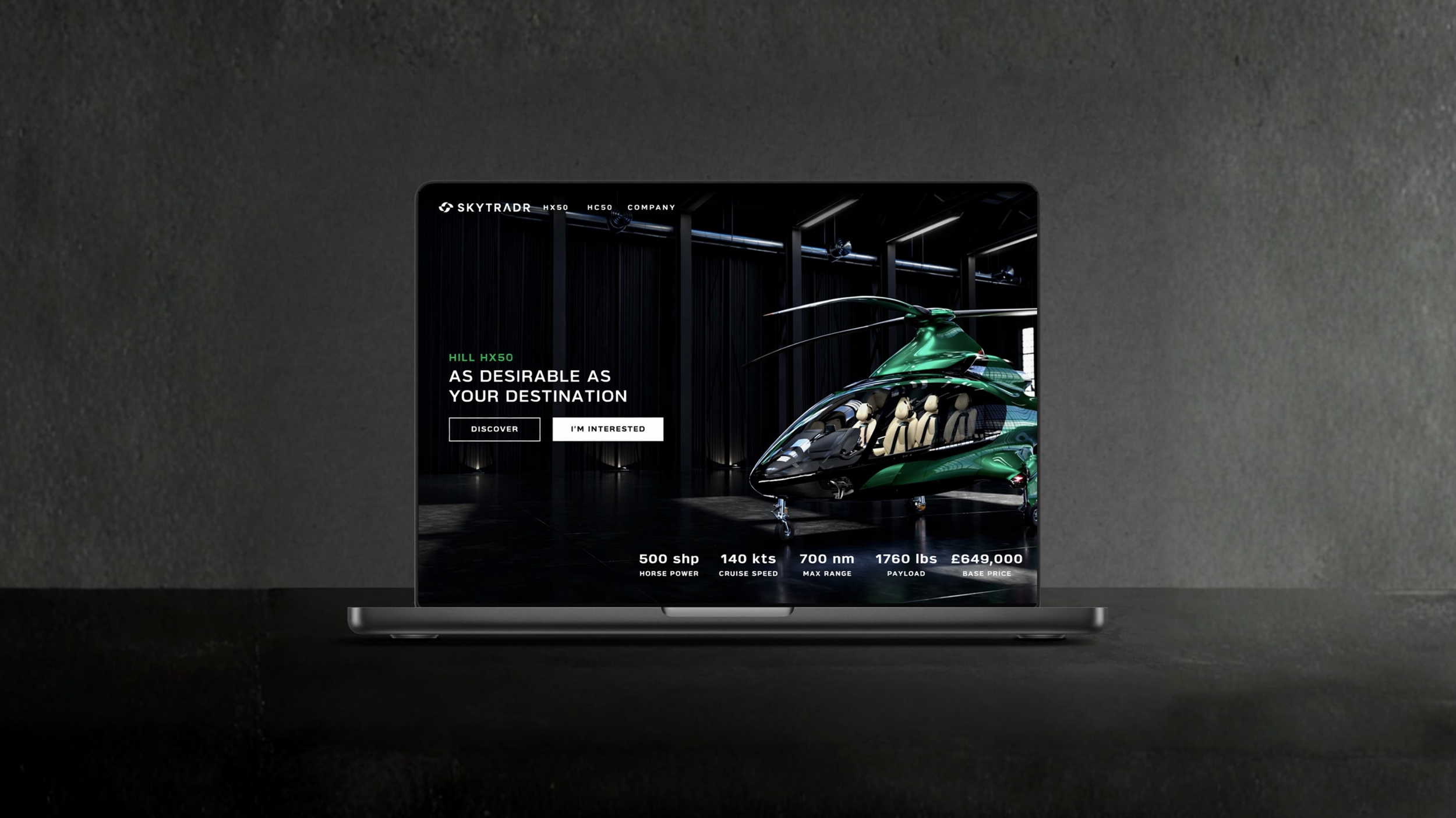
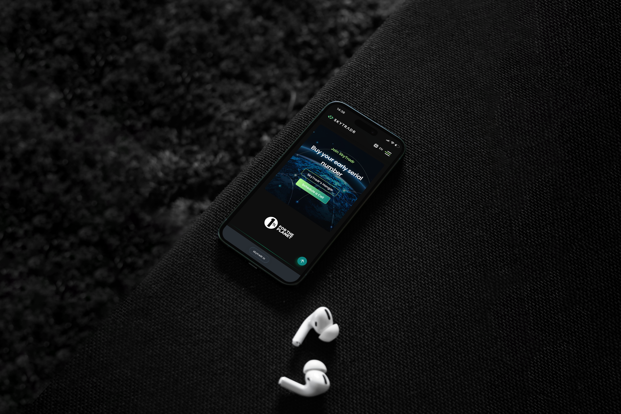
UI/UX CONSULTANCY
PLATFORM EXPERIENCE
While Limenzy led the website development, Legs Brands provided strategic UI/UX direction to ensure the platform experience aligned with the brand’s values and audience expectations.
Our consultancy focused on:
Interface clarity and intuitive navigation
Visual consistency between brand and product
Reducing friction across key user journeys
The outcome is a platform that feels considered, credible, and easy to use — even within a complex transactional environment.
Execution
ENGINEERED FOR THE FUTURE OF FLIGHT
Execution focused on translating Skytradr’s brand strategy into a refined, scalable system that performs across platforms. From identity rollout to digital experience, every decision was made to support credibility, innovation, and long-term growth within a highly technical industry.
-
Skytradr’s identity system is modular by design — allowing for adaptation across aircraft models, technologies, and future offerings while maintaining strong brand recognition.
-
Visual styling leans into contrast, depth, and controlled minimalism. Dark interfaces, precision typography, and restrained colour usage reinforce a sense of authority and advanced engineering.