CHALLENGE
Honey Guide approached us with a mission: to encapsulate their rare positioning at the intersection of luxury travel, conservation funding, and immersive environmental education.
Our challenge was to translate this purpose-driven model into a cohesive brand identity and digital presence — developing a visual and verbal system that speaks to discerning global travellers while remaining grounded in ecological integrity and real-world impact.
From logo design and brand language to a refined website experience, the result is a complete narrative ecosystem that elevates safari beyond tourism, positioning each journey as a meaningful contribution to conservation, community partnerships, and long-term wildlife protection.
STRATEGY
Our strategy was to position Honey Guide as a conservation-first operator, not a tourism provider — aligning the brand with a global audience seeking depth and meaning in their travel experiences.
Rather than presenting Honey Guide as a traditional safari offering, the focus was on repositioning the brand around conservation, education, and immersive field experience.
HONEY GUIDE TOURS
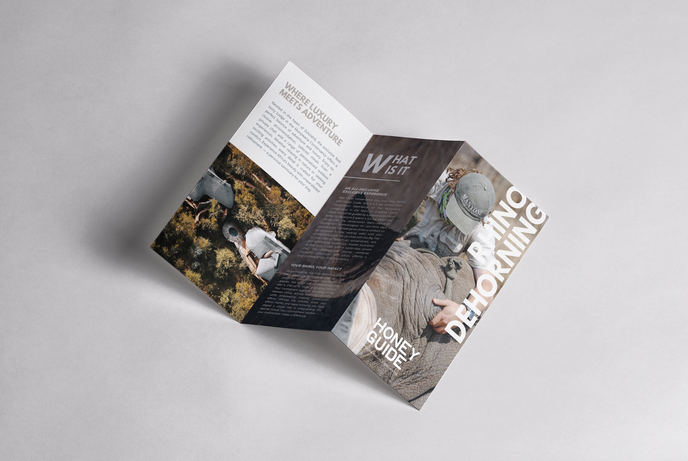
Bespoke Conservation Experiences
A CONSERVATION-LED LUXURY TRAVEL COMPANY IN SOUTHERN AFRICA
Honey Guide Experiences is a conservation-led safari brand operating in Zululand, offering immersive, purpose-driven travel rooted in wildlife protection, local partnerships, and authentic bush experiences.
The project focused on repositioning the brand to reflect its deeper conservation mission while elevating its visual identity, digital presence, and storytelling to appeal to a more conscious, experience-driven traveller.
-
Honey Guide operates in a space where luxury travel is shifting toward purpose, authenticity, and conservation credibility.
Our research focused on how the brand could clearly differentiate from traditional safari operators by positioning each journey as meaningful participation in real work on the ground.
-
The concept centred on safari as more than escape — an experience built around access, education, and impact.
Honey Guide needed a brand world that felt refined, immersive, and deeply connected to the landscapes and partnerships behind every journey.
Branding & Identity
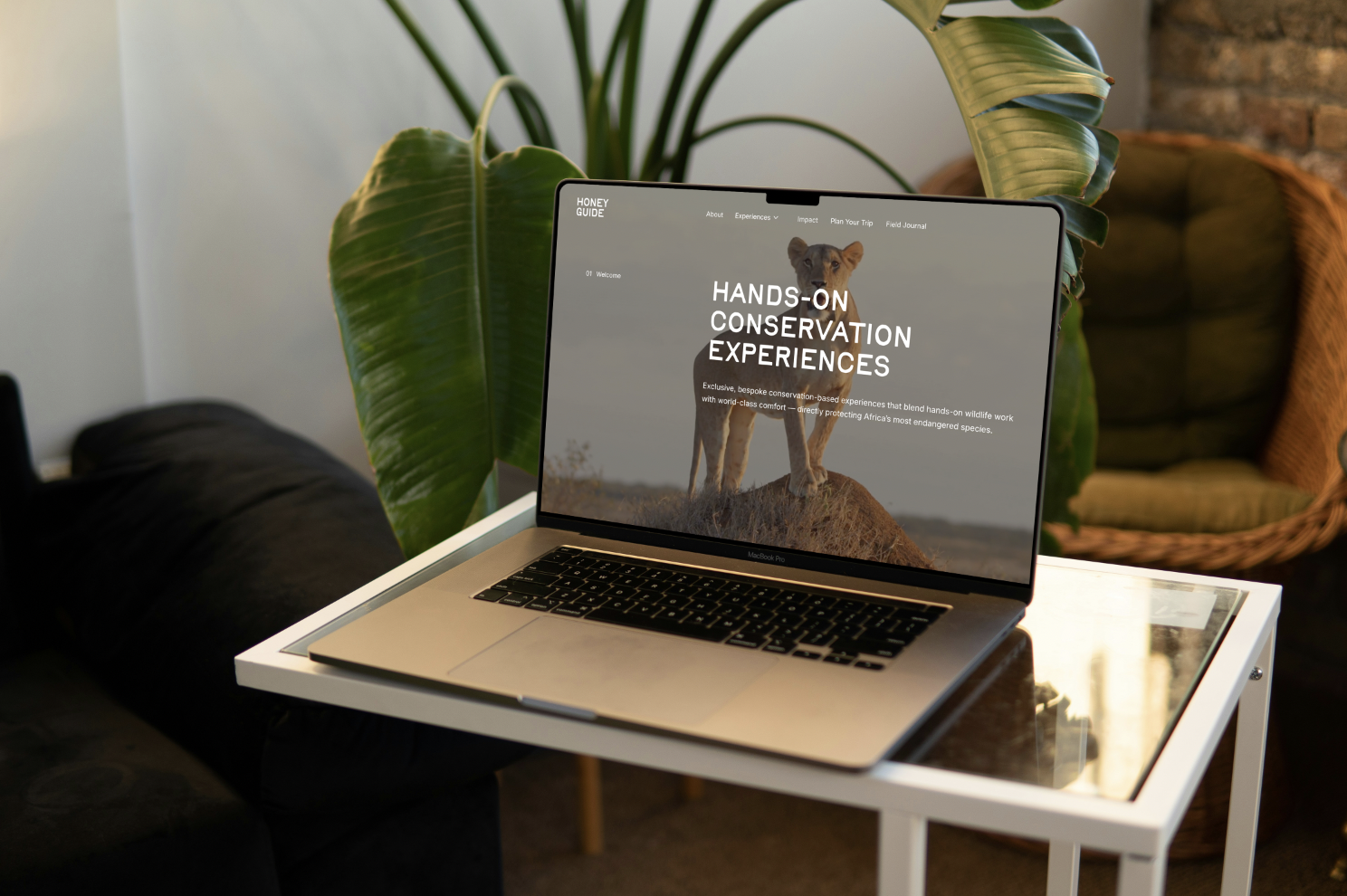
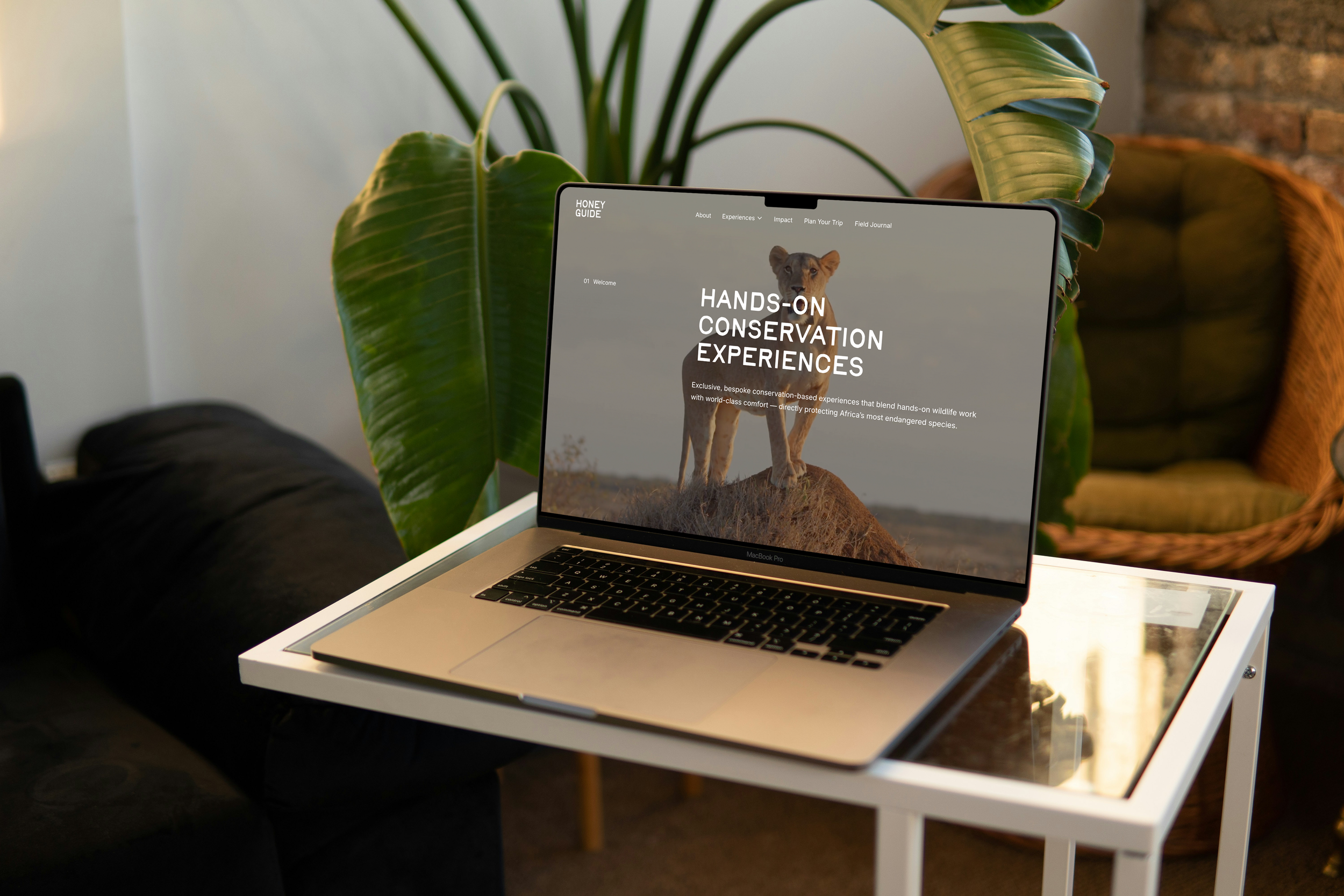
PURPOSE-LED HANDS-ON CONSERVATION EXPERIENCES
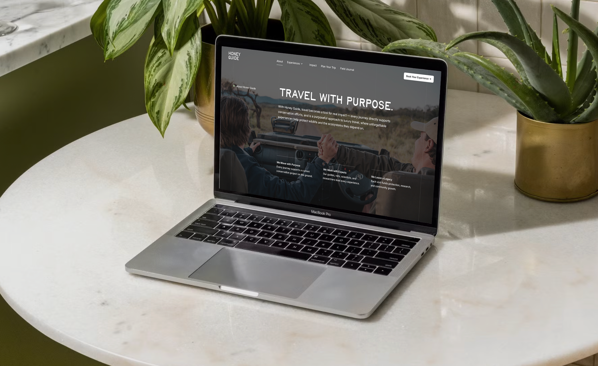
Honey Guide Experiences is a conservation-led company, where travel becomes a tool for real impact — every journey directly supports conservation efforts, and is a purposeful approach to luxury travel, where unforgettable experiences help protect wildlife and the ecosystems they depend on.
Legs Brands was brought in to build a cohesive brand world around this model: refining Honey Guide’s positioning, designing their visual identity and logo system, and translating it all into a refined digital experience.
The result is a complete brand ecosystem that communicates trust, exclusivity, and impact — helping travellers clearly understand what Honey Guide is: not tourism, but purpose-driven travel that funds real work on the ground.
WORDMARK
-
The Honey Guide wordmark was designed to reflect the brand’s ethos: understated luxury, ecological respect, and intimate connection to place.
Rather than relying on traditional safari symbolism, the logo feels quiet, organic, and timeless — positioning Honey Guide as a premium, conservation-first experience rooted in real impact.
-
The wordmark is set in Birdie, a handwritten typeface chosen to introduce warmth and a human touch.
It evokes field notes, personal guidance, and authenticity — reinforcing Honey Guide’s balance of refinement and grounded connection to the wild.
WEBSITE DEVELOPMENT
A REFINED DIGITAL PRESENCE
For Honey Guide, the website was never meant to follow the conventions of a traditional safari brand. Instead, the goal was to create a digital experience that reflects what the brand truly is — hands-on conservation, real-world impact, and curated luxury .
From a Legs Brands perspective, this meant designing something that feels intentional, stripped-back, and distinctly different — allowing the purpose behind the brand to lead, rather than relying on expected safari aesthetics.
-
The design language is deliberately restrained. Inspired by natural tones and the stillness of the bush, the interface uses minimal colour, strong typography, and generous negative space to create a calm, editorial feel.
Rather than overwhelming the user, the design allows each image and piece of content to carry weight — mirroring the Honey Guide philosophy of slow, meaningful, and immersive experiences. The result is a visual identity that feels both grounded in nature and elevated in execution, standing apart from the often cluttered safari space.
-
Functionally, the site is built to guide users through a narrative — from understanding the purpose behind Honey Guide to exploring experiences and taking action. Each journey is bespoke and tailored, and the website reflects this through a clear, considered structure that prioritises flow and clarity .
Navigation is simple, content is purposeful, and every interaction reinforces the core message: this is not passive travel — it’s participation in real conservation, delivered through a seamless and premium experience.
The Outcome
A BRAND WORLD BUILT THROUGH STORY, DESIGN, AND CONSERVATION CREDIBILITY
In shaping Honey Guide’s brand, our focus was to reflect their rare balance of refinement and real conservation work in the field.
We developed a complete identity system — logo, typography, colour palette, and visual direction — alongside a digital presence thatpositions Honey Guide as a purpose-led safari experience.
The result is a brand built on trust, depth, and meaningful connection to the wild.
VISUAL
SIMPLE, LUXURY & NATURAL
For Honey Guide, the visual strategy was built around authenticity — capturing the bush as it truly is: quiet, immersive, and deeply connected to place. We created a design system that feels elevated yet natural, where luxury is expressed through access, stillness, and meaning rather than excess.
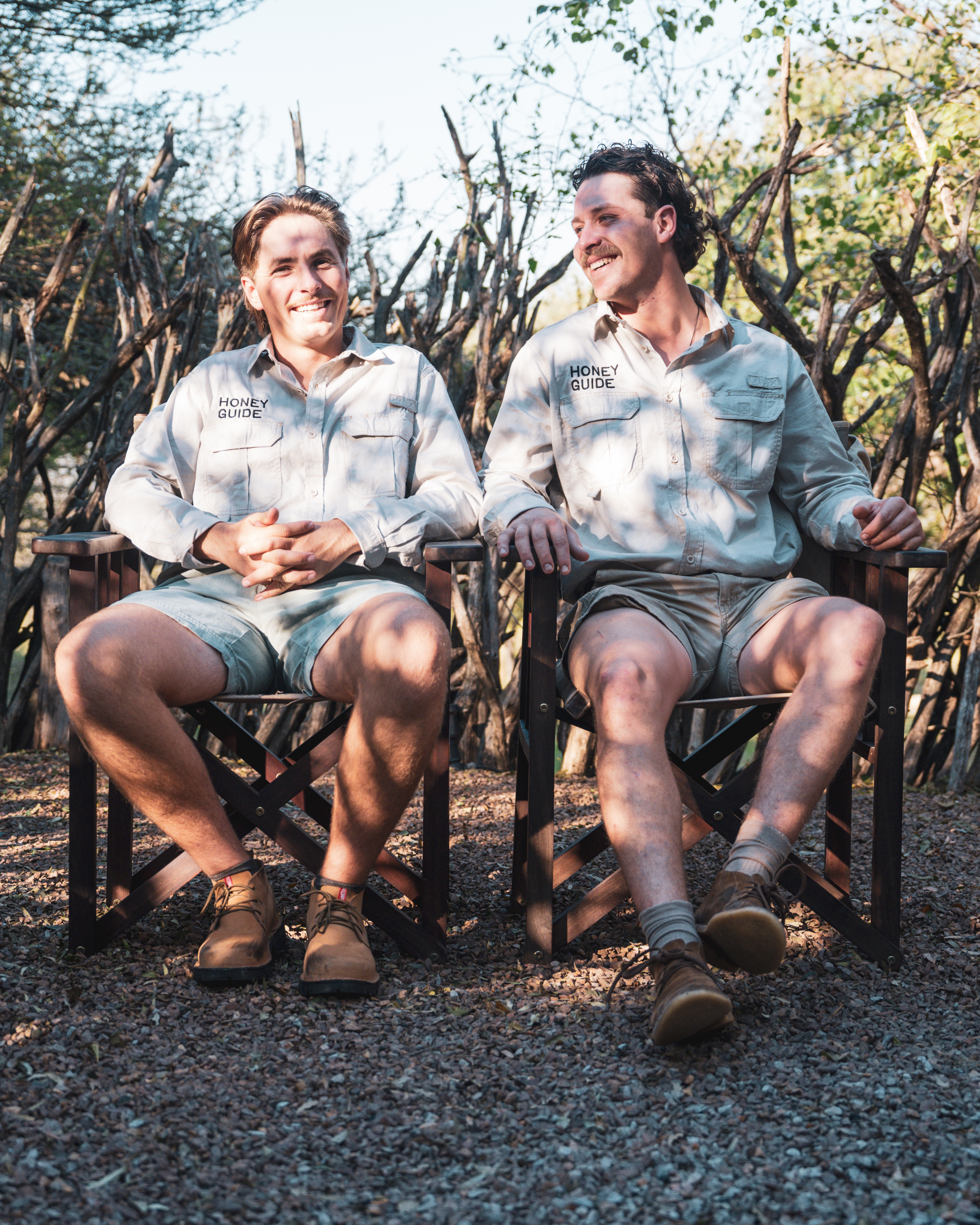
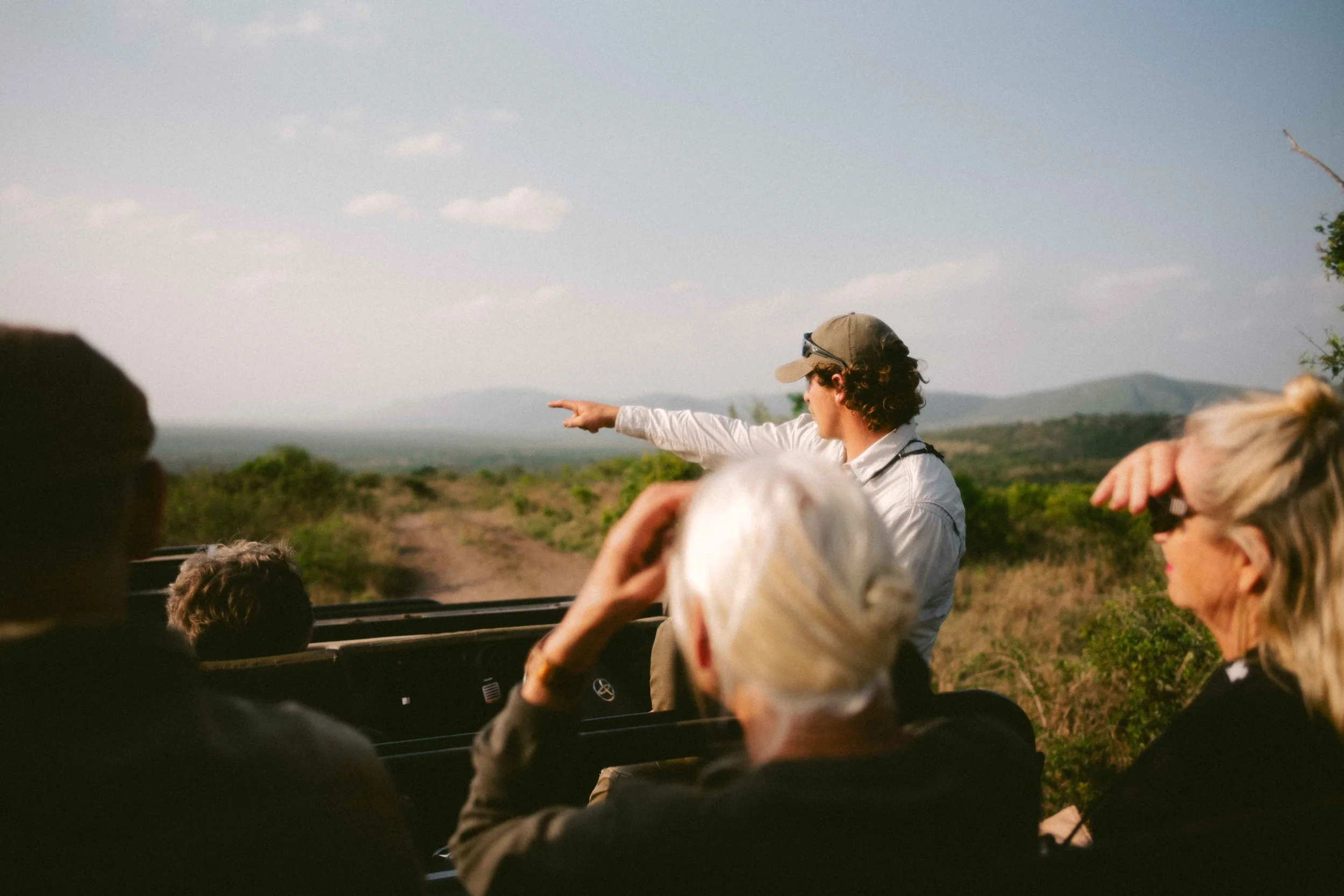
Honey Guide imagery is grounded in real moments — conservation in action, landscapes at their quietest, and rare encounters experienced with depth and respect.
Photography is treated as storytelling, capturing safari as immersive, intimate, and purpose-led, rather than staged or performative. The result is a visual archive that reflects authenticity, trust, and connection to the wild.