LOREN DE VOS INTERIORS
Designing spaces that feel lived in, intentional, and quietly luxurious.
CHALLENGE
Loren Devos Interiors approached us to create a brand identity that reflects their timeless designs and calm, considered approach to interior spaces.
The goal was to create a brand and website that captured the studio’s aesthetic — warm minimalism, natural textures, and timeless interiors — while positioning Loren as a premium interior designer in a competitive market.
The challenge was balancing editorial elegance with digital clarity, ensuring the website felt as curated as the spaces she designs.
STRATEGY
We approached the project by building a brand system rooted in restraint, texture, and spatial storytelling. Rather than creating a loud digital presence, the goal was to design something that felt calm, confident, and architectural — mirroring the philosophy behind Loren’s interiors.
The strategy focused on three core pillars:
• A refined visual identity inspired by material palettes & natural light
• A website structure that prioritises imagery and spatial storytelling
• Subtle motion and typography to create an editorial experience
Loren Devos Interiors
INSPIRED SPACES FOR MINDFUL LIVING
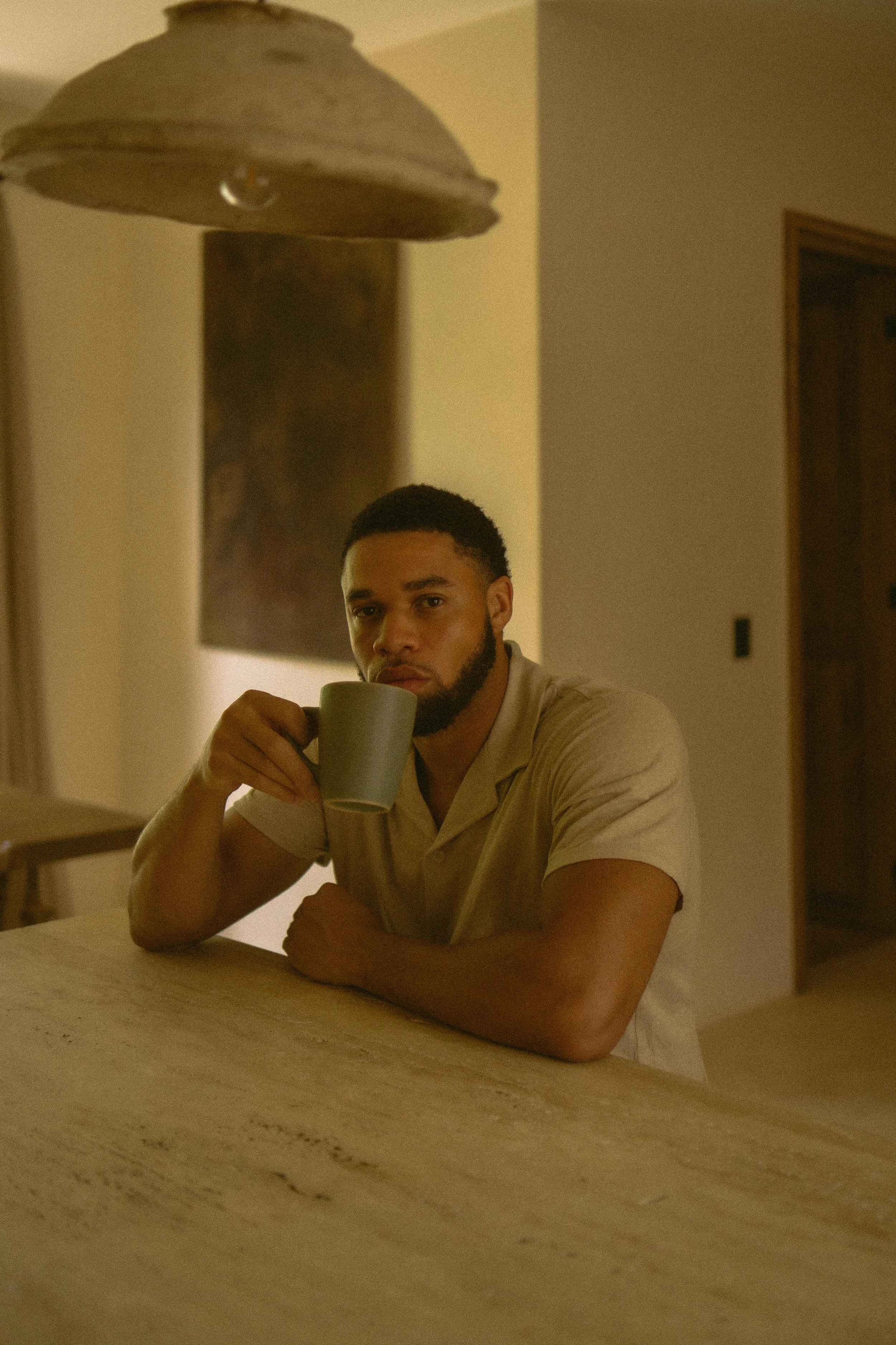
Loren Devos Interiors is a high-end interior design studio based on the North Coast of KZN, specialising in bespoke residential and boutique hospitality interiors.
The visual identity was designed to reflect the studio’s philosophy of understated luxury. A restrained palette of warm neutrals, soft typography, and generous whitespace allows the interior photography to take centre stage.
The result is a brand system that feels calm, confident, and timeless
-
We conducted in-depth market and audience research to understand the expectations of design-conscious homeowners, developers, and collaborators within the premium interior space. This phase informed how Loren Devos Interiors could clearly differentiate itself through restraint, craftsmanship, and a deeply personal design approach.
-
The core concept focused on creating a brand that feels timeless rather than trend-driven. We shaped a visual and verbal direction rooted in calm confidence, natural materials, and intentional living — allowing the work itself to take centre stage.
PERSONA MAPPING
-
Using in-depth persona research, we identified and mapped three core audience groups:
Residential Client: The Higher-Income Family
Commercial Client: The Boutique Hospitality Investor (Airbnb & Boutique Hotels)
Influencer / Trendsetter: The Design Connoisseur
-
These personas shaped how the brand communicates, what it prioritises visually, and how it positions its services — ensuring relevance across both private residential and design-led commercial projects
PURPOSE DISCOVERY WORKSHOPS
-
We facilitated a purpose discovery process to clearly articulate Loren Devos Interiors’ reason for being, values, and long-term vision. This work anchored the brand in authenticity — ensuring that every visual and verbal decision reflects the studio’s commitment to thoughtful, natural, and elevated design.
-
We supported the workshop insights with broader research into leadership, performance coaching, and behavioural science.
The outcome was a clear internal compass that guides how the brand shows up across client work, communication, and content.
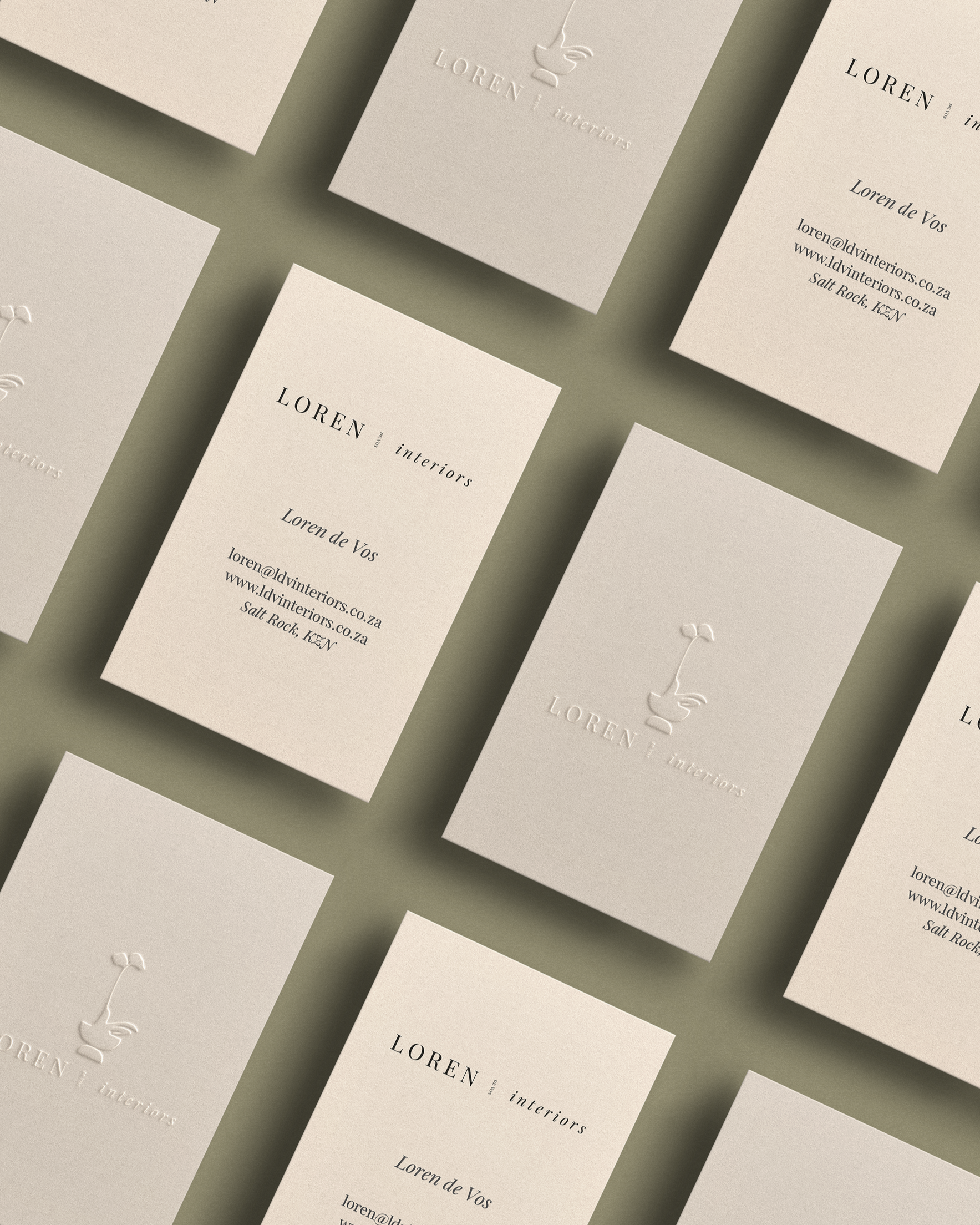
Branding & Identity
DESIGNING THE BRAND
Rather than creating a loud or decorative brand, the focus was on restraint and balance.
The logo and typography were developed to feel architectural and editorial — something that could sit comfortably within the pages of a design magazine.
A neutral palette inspired by natural interior materials ensured the brand would complement the studio’s photography rather than compete with it.
WORDMARK
-
The wordmark strategy prioritises longevity and versatility across both digital and physical applications. A clean, considered typographic treatment ensures clarity at all scales — from large-format signage to subtle brand collateral. By avoiding overt embellishment, the wordmark reinforces the studio’s position as sophisticated, architectural, and detail-focused.
-
Playfair Display
The chosen typeface reflects the balance between elegance and structure found throughout Loren Devos Interiors’ work. Its refined letterforms, measured contrast, and generous spacing evoke calm confidence and professionalism. Used consistently, the font supports a cohesive visual language that feels modern yet enduring, aligning seamlessly with the studio’s design philosophy.
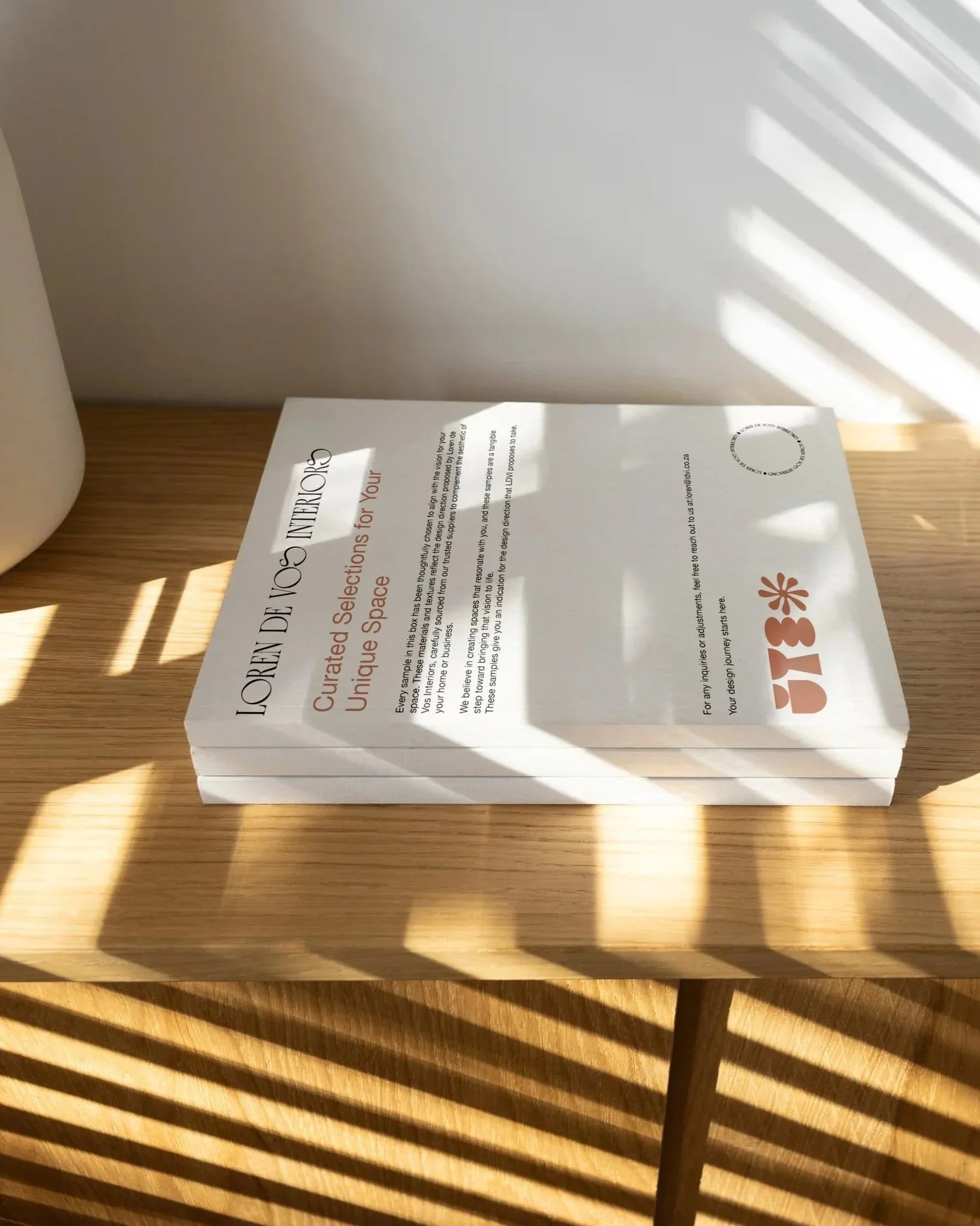
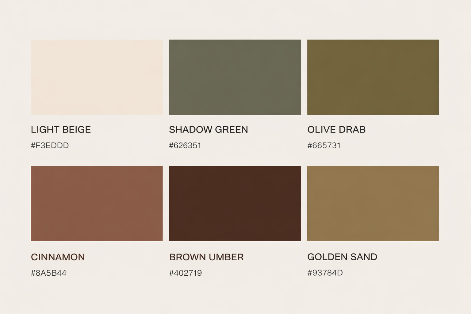
COLOUR USAGE
-
The primary colour palette for Loren de Vos Interiors is warm, grounded, and timeless. Anchored in earthy, natural tones, it reflects the brand’s connection to craftsmanship, materiality, and considered living.
These colours form the foundation of the visual identity, creating a sense of calm sophistication while allowing spaces, textures, and forms to take precedence.
The palette is designed to feel enduring rather than trend-led, supporting a refined and quietly confident aesthetic across both digital and physical touchpoints.
-
The secondary colour palette complements the primary tones with softer neutrals that add balance, depth, and versatility to the visual system.
Warm tones are used to support layout, hierarchy, and breathing space, ensuring the brand remains elegant and adaptable across applications.
These colours enhance readability and structure while maintaining the understated, natural character that defines the Loren de Vos Interiors brand.
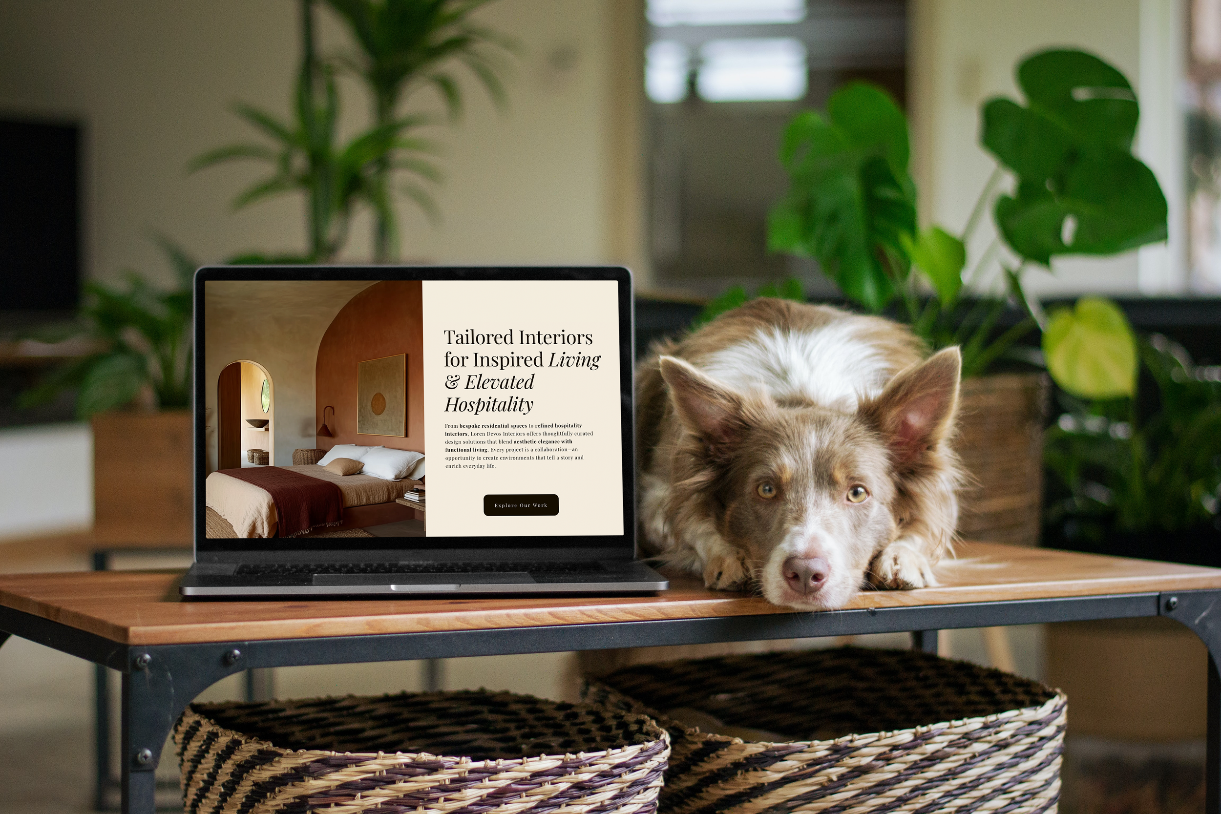
Website Design
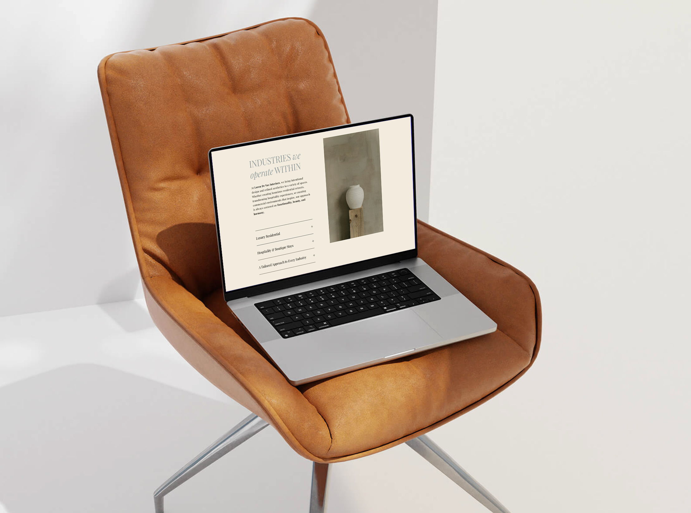
FROM BRAND TO DIGITAL
The website was designed with the same principles that guide Loren’s interiors: balance, simplicity, and attention to detail. Navigation was intentionally minimal, allowing the focus to remain on the spatial experience of each project. Subtle motion and transitions add rhythm without distracting from the work itself.
The result is a digital platform that mirrors the atmosphere of Loren’s interiors — quiet, refined, and thoughtfully composed.
-
The website needed to function primarily as a visual portfolio, allowing Loren’s interiors to speak for themselves while still guiding visitors through her design philosophy.
Instead of building a conventional business website, the goal was to create something that felt closer to an editorial design publication.
Large-format imagery, generous whitespace, and refined typography were used to create a calm browsing experience.
-
Styling across the website is guided by simplicity, natural textures, and tonal harmony.
A restrained visual system anchors the brand. The identity is confident yet quiet, positioning the studio as timeless, considered, and deeply intentional in its craft.
The Outcome
A BRAND THAT REFLECTS THE COMPANY PHILOSOPHY
The completed brand and website now present Loren de Vos Interiors as a cohesive studio with a clear visual identity. The platform acts not only as a portfolio but as an introduction to Loren’s design philosophy, helping potential clients understand the character of the work before the first consultation.
By building the identity first and the website second, the digital presence now feels aligned with the interiors themselves.